Category Archives: Project 3 – Colour relationships

Part Two: Project 3: Exercise 3b: Still life with complementary colours

I began this exercise by trying to determine what kind of colour combinations I’d like to see on a larger scale, for this particular still life.  In my A4 sketchbook, I tested out a couple of colour schemes in coloured pencil that I felt would work, still retaining a similar colour on the shoe for realism but then altering the colours a little more for the other objects.

My favourite complementary colour scheme is orange and blue, but I didn’t want to resort to these as the original colour of the spotty top is blue.  So, using my new pocket colour wheel (extremely useful), I determined a couple of schemes that would work and tested them out.  The first was sort of a split complementary scheme (red-violet, blue-violet and yellow-green), but I found the colours a little too garish and wasn’t looking forward to replicating that on a larger scale.  The second was red-orange and blue-green, and this one I found a lot more visually pleasing.  As a natural redhead I’ve always been drawn towards the teal/turquoise colours as it brings out my hair, so perhaps this is why I preferred this one!  All of the tones were much more subtle and I felt the large blue-green expanse of the spotty top would look much better when painted in a large format.

IMG_1384

Rather than another A3 painting, I decided to do this one on a slightly larger piece of Acrylic paper(20×16″).  I have only just invested in this and find it a lot better quality than thick cartridge paper as it holds the paint better.  I drew in the outlines loosely with a wash of burnt umber and then began to flesh in the colour of the shoe.  To achieve the rich, burnt orange hue I mixed Cadmium Red with Cadmium Yellow and then added varying amounts of Mars Black for the shadows, and Titanium White for the highlights.

IMG_1392

I continued to refine the shoe until I was happy with the contrasts and then I moved on to the next object.

IMG_1393

I used somewhat of a glazing method to complete the rest of the painting, by watering down and blocking in the larger areas and then adding subsequent layers. The material of the top was painted with a mixture of Pthalo Blue and Cadmium Yellow, lightened with Titanium White.  The darker areas were achieved with a little extra Pthalo Blue and Mars Black.  I struggle occasionally with depicting fabrics and their folds, so I worried that the shadows I had laid down here were too strong.  I decided not to fuss with this too much until more of the painting had been completed, so therefore moved back to the perfume bottle and fleshed this in with a watered down tint using the same but lightened colour from the fabric.

IMG_1420

I had to build up layers of white on the perfume bottle to make it convincingly reflective, and this took time.  A drybrush technique was used to add the reflected colours seen through the cloudy glass, coming from the top behind, and I made sure to add this colour to the liquid in the bottle also, so that it appeared transparent.  When I was happy with the bottle, I moved back to the folds of the fabric and mixed a mid-tone colour to blend the darkest shadows and accentuate the highlights.

At this point I noticed that the fabric had a darker edge all around, due to the gauzy material and the light passing through it, therefore I added this and immediately saw a difference in its appearance and how it become more three-dimensional.  I decided on the altered colour of the dots (white, lime green, red-orange and forest green) and added these in, in varying strengths to reflect where on the fabric they lay.  The necklace was completed after this, and I only altered the colour of the stone here and kept the colour of the metal relatively similar to the original.  I mixed up a pale orange-red for the background and washed this in, with a darker mixture for the table’s edge.  A translucent red shadow was then added at the bottom-right of the fabric, to give the illusion of it occupying the space and not just floating.

IMG_1477

Now that all of the main objects were completed and each area had colour, it was time to go back over the entire composition and assess whether or not the colours were how I wanted them, and that there was sufficient contrasts between the lights and darks.  For example, I strengthened the darks and shadows in the shoe and under the fabric to create depth, added more highlights to the perfume bottle to replicate its material, and lightened the table at the top-right to show how the strong natural light was reflecting off of it.

IMG_1480

I am happy with my choice of colour scheme here, and had many comments about how this version is preferred more than the original, due to the more subtle colours, closer viewpoint and size of the painting.  This exercise has most certainly increased my confidence in using my own judgement to alter colour schemes and apply them to objects, rather than working from a visual reference where colours are already pre-determined.

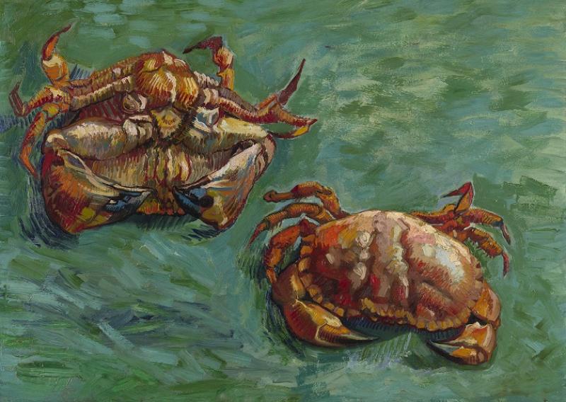
It was only after I had completed this painting, having it politely pointed out by my daughter, that the colours I had used were very similar to those used in Van Gogh’s Two Crabs; a painting that really struck me at the National Gallery’s Making Colour exhibition recently.  This one must have stuck in my mind and subconsciously influenced my decision when deciding on a colour scheme!

van Gogh_Two Crabs_oil, 1889
Vincent van Gogh: Two Crabs, oil, 1889


Part Two: Project 3: Exercise 3a – Colour Accuracy

As mentioned in the course book, being fiddly with precise lines and perspective was not really called for in this exercise and therefore I was able to relax into the task, as previous still life paintings have had me, well, a little panicky!

I decided to choose four items that were closely linked in theme, that I use a lot and also that have very interesting colours; a chiffon-style blue top with coloured dots, a velvety maroon peep-toe stiletto with bow, a bottle of perfume in a distinctive bottle and a statement necklace in bronzey-mink.  I began by arranging them on my dressing table and doing rapid compositional sketches in charcoal.  For some reason it felt right to have the shoe on the left of the composition, perhaps because this showed off the bow detail better.  I liked the fact that there was strong light coming through the window behind the objects which lit up the bottle of perfume and certain areas of the gauzy fabric, which provided the light areas against some quite strong darks inside the shoe and the fabric gathered around the shoe.  I used coloured pencils to try and quickly identify  all of the colours I could see, in the individual objects.  I was perhaps quite surprised that the perfume bottle possessed so many subtle hues, such as lilac and peach.  I settled on composition no. 2 as I quite liked the strong angle of the shoe as it leads the eye in from the top-left.

IMG_1226

I began by using a thinned down Raw Umber mix to block in all of my basic shapes.  Getting the angles of the lines on the shoe right was rather tricky so I found myself having to adjust my position slightly so that my arm and hand could follow a more natural arc.  Once these shapes were established, I began to paint in acrylics the shoe; this object was made up of varying mixtures of Crimson, Ultramarine, Pthalo Blue and Titanium white.  I found I had to revisit the shoe in places to achieve a deeper shadow inside the show, and also a highlight around the edging of the shoe to create depth.  I intentionally used a scumbling effect with my brush here, to suggest the velvety texture.  Once I was happy with this, I moved on the concentrate on the areas surrounding it; the table top was almost white with light on one side, and then I applied different blues in various glazed layers to create the depth needed to suggest a gauzy material that was bunched up.  Coloured spots were also added in glazes, until the right colour intensity was achieved.

IMG_1105


Continuing to add in colour around the main objects, I painted in the horizontal lines behind the composition, to suggest radiator, windowsill etc.  I blocked in the main colours of the perfume bottle, namely the reddish-purple and orange of the lid and tassle, and then more subdued similar colours on the bottle itself, by using lots of white to achieve subtle tints of lilac and peach.  I continued on with the glazing of layers for the chiffon top, working on one section at a time using folds in the material as markers for where to stop.

IMG_1130


I continued on in this way with the fabric, adding the coloured dots in varying intensity as I went along.  I used a mixture of the two blues with Paynes Grey to get a deep shadow in the creases of the fabric, and lightened with white for the highlights on the crest of the folds.  In some places the light shone through the fabric creating a pinky-blue hue (to the right of the perfume bottle, and at the left edge of the painting), and I recreated this texture and colour by scumbling once again.  The necklace was perhaps the most difficult object to do justice to colour-wise, as the bronze tone was difficult to recreate.  I found myself repainting it around three times but was finally happy when I added shiny highlights in pure white – this gave it the three-dimensional look I was after.

Finished painting, acrylic on A3

I am confident in my choice of colours here, although I did choose some rather challenging subjects!  I worried that the fabric would be impossible to recreate but in fact this was the most enjoyable object for me to paint in the whole composition.  I especially like how the blue is framed on both sides by the wooden dressing table top that carries a slight hint of its complementary colour.  I was surprised that the smallest objects – the neckalce and the perfume bottle – were the hardest to paint.  I believe this is because their colours are so subtle  – with the glass of the perfume bottle being particularly tricky – and not as bright and ‘opaque’ as the other objects.  The composition seems to have worked out well also, with the shoe leading in, following the creases of the clothing and then ending in the tear-shaped pendant.

Research Point: Neo-Impressionism and Op-Art

Neo-Impressionsm, Pointillism and Divisionism

I have always been in awe of colour, and its usage, trying to read about it when I can and also going as far as reading where original pigments come from (most notably, reading ‘Colour – Travels through the paint box’ by Victoria Finlay).  But there is something rather exciting about this particular technique of actually using colour in art, the technique called Pointillism.  Perhaps it is because it is based in science that I find it more interesting than the just origins of colour, and it is, I feel, an extraordinary discovery looking back at the history of art.

The most notable name in the Neo-Impressionist movement, which fostered this style of painting, was Georges Seurat (1859-1891).  He was pretty much the leader, and believed that applying separate, small areas of colour beside each other would result in a more vibrant painting, rather than using pre-mixed colours from a palette.  The term Divisionism was used, which speaks for itself; the separation of colour into individual strokes.

To look at Seurat’s work is to witness the dedication to the cause; take for example The Seine and Le Grand Jatte, Springtime; light emanates from the piece, with paler strokes of pink and blue in the water adding to its shimmering effect and pulsating with movement.  The pointillist effect here adds to the realism of the leaves on the trees, making them appear detailed, when in fact on closer inspection there is a huge array of colours placed together to give the impression of branches full with luscious foliage.  The buildings in the background are suggested with groupings of colour that are not realistic but give the impression that they are there.

Georges Seurat: The Seine and Le Grand Jatte, Srpingtime, oil on canvas, 1888

Perhaps departing from the norm, Seurat’s The Circus also successfully employs the use of pointillism to convey a rich, luxurious setting; complementary colours abound here, with the blue-purple shadows adding vibrancy to the yellow-orange tones throughout, giving the sense of warm, glowing light.  The white horse is expertly rendered with dots of blue and purple in its shadows, and the supposedly black dinner suit of the gentleman in the middle-right relies not on black dots but a mixture of colours that are seen throughout the piece, to give the illusion of a black suit that is reflecting light.

Georges Seurat: The Circus, oil on canvas, 1891

If were not for Paul Signac (1863-1935), and his tireless fight for the Divisionist cause, Neo-Impressionism may have died out after Seurat’s tragically early death.  He introduced Divisionism to critics and writers, who went on to essentially sing its praises.  Signac believed that to ‘divide’ helped to retain the luminosity and harmony of colours.

One stunning work from this advocate of pointillism is The Pine Tree at St Tropez, which shows a masterly way of applying almost every imaginable colour of the spectrum and managing to achieve optical mixing with it. The shades of green and pink in the sky speak of a warm, sunny day, and the mix of blues and reds successfully convey shadows within the leaves.  The orange and red-pinks of the tree hints at warm sunlight striking the bark, and the blue-green of the background helps other objects to recede and push the tree towards the viewer.

Paul Signac: The Pine Tree at St Tropez, oil on canvas, 1909

Another colourful example is Signac’s Venice, The Pink Cloud; once again, the sky is purposely made atmospheric and the pinks and purples create some blue tones that are then echoed in the water.  The distant building is being bathed in light and this is shown with vibrant pink and orange.  It is difficult to tell if the sail of the boat is in fact this green, however this colour is complementary to the pink tones in the sky and the red of the boat and this helps to establish it as the focal point of the piece.

Paul Signac_Venice, The Pink Cloud_1909_oil on canvas
Paul Signac: Venice, The Pink Cloud, oil on canvas, 1909

Others who embraced this style of painting were Camille Pissarro (1830-1903)and Hippolyte Petitjean (1854-1929).  Pissarro saw this as the ‘new phase in the logical march of Impressionism’, and his works – such as The Dunes at Knocke, Belgium – were luminous with colour but in a subtle, understated and idealistic way.  Petitjean showed how it was possible to employ this technique in watercolours, with works such as Le Pont Neauf, where the white of the paper showing through added even more to the ‘shimmering’ effect.

Camille Pissarro: The Dunes at Knocke, Belgium, oil on canvas, 1894-1902
Hippolyte Petitjean: Le Pont Neuf, watercolour and gouache, c. 1914

Bridget Riley and Op-Art

Bridget Riley (aged 83 at the time of writing this post) was, it appears,  passionate about teaching her students to think in terms of shape, line and colour rather than blindly copying the world around them.  She was involved in art from a very early age, and attended the Royal College of Art from 1952-1955 before becoming frustrated at the teaching style and her inability to develop her own style within such an institution.

When attending a summer school in Norfolk in 1960, she met Maurice de Sausmarez, who encouraged her to look at the work of Georges Seurat.  His influence clearly shows in Pink Landscape; colour is applied in individual dots with attention paid to complementaries i.e. the blue in the top of the painting against the yellow-orange at the bottom, and also some red at the top, with dashes of green at the bottom.  This implies she had studied his work closely and understood how these colours related to eachother when applied in a Pointillist style.

Bridget Riley: Pink Landscape, oil on canvas, 1960

Soon after, she was experimenting with a more graphic style, employing the use of black and white squares and altering the way the eye perceived them by alternating the size and shape.  Critics merely dismissed works such as these as ‘trompe l’oeil ‘ (trick of the eye).

Bridget Riley: Movement In Squares, tempera on board, 1961

In 1965, Op Art reared its head.  Riley was quoted as saying, by way of explanation:

“I couldn’t get near what I wanted through seeing, recognizing and recreating, so I stood the problem on its head. I started studying squares, rectangles, triangles and the sensations they give rise to… It is untrue that my work depends on any literary impulse or has any illustrative intention. The marks on the canvas are sole and essential agents in a series of relationships which form the structure of the painting.”

In 1967, she began to introduce colour to her work and the positioning of these colours created movement; most notably so in Cataract 3.  The way the colours are grouped together affects the spaces between them so that one can catch glimpses of other colours, which in turn produces the illusion of movement; it is truly amazing.

Bridget Riley: Cataract 3, PVA on canvas, 1967

After a visit to Egypt in 1981, Riley became captivated with the intense, shimmering colours used in Egyptian art, and used these in her own work to produce varying groups of colour and light effect i.e. in RA 2, the use of white and other pale vertical lines give a sense of pulsating light, and to take in the painting as a whole, it positively vibrates with various light and colour effects, seemingly ever-changing as the eyes are moved over the piece.

Bridget Riley: RA2, silkscreen on paper, 1981

References:

http://www.georgesseurat.org

http://www.paul-signac.org

http://www.metmuseum.org

http://www.moma.org

http://www.op-art.co.uk


Part Two: Project 3: Exercise 2 – Successive Contrast

For this, I chose my A4 sketchbook, and began by painting almost two thirds of the page with Cadmium Red straight from the tube.  As instructed by the course book, I stared at this patch of colour for 30 seconds before closing my eyes, and found to my astonishment a perfect, straight-edged luminous light green rectangle before me (I can even see it now on this white screen as I type, peeking out from behind the red and then disappearing when I try to look at it…).  So, indeed, the complementary colour appeared although not a saturated green, but an almost lit-up blue-green, like that you would see on a neon sign (I tried to recreate this with a swatch of coloured pencil, bottom left).

IMG_0849


Next, I chose what I believed to be the most vivid pigment I owned – Viridian – and painted a small square, before staring at it for 30 seconds.  The effect was almost the same as before, although this time I was shifting my gaze to paper rather than closing my eyes, and the colours were reversed i.e. this time, the resultant colour was a neon peachy-pink (almost red).

I decided to look into successive and simultaneous contrast a little more, to cement my understanding of the two terms:

Successive Contrast

This is the effect of previously viewed colour fields, when the gaze is shifted elsewhere.  When viewing two coloured blocks together, for example, and then shifting your gaze to two plain blocks, the colours will be reversed, and will be a lot paler.  When again looking at two coloured blocks, and then shifting your gaze to the same image but where the colours are paler, the fact one has viewed the darker colours beforehand will make the paler ones appear almost grey.  After-images of successive contrast can alter not just plain, but coloured fields also.

Simultaneous Contrast

When the same colour can appear different due to the colour of its background; the surroundings of an object can affect the object itself.  Colours of objects don’t actually change, only the way we see them changes.  The effects are more evident when complementary colours are placed side-by-side; for example, if blue and red flowerbeds were placed next to eachother, the red would make the blue appear more green, and the blue would make the red appear more orange.  The two colours impose their complementaries onto eachother.

References:

http://www.colorusage.arc.nasa.gov

http://www.webexhibits.org


Part Two: Project 3: Exercise 1 – Exploring contrasts

I chose an A3 sketchbook page for this exercise as I felt it was neither too big or too small to place the related mini-exercises together for ease of reference.  I began by selecting Ultramarine as my colour A, and the proceeded to mix similar colours using mixtures of Ultramarine, Emerald, Viridian , Cadmium Red and also Blue Lake straight from the tube.  I found that the darker the surrounding colour (i.e. Ultramarine and Viridian mix), the lighter the Ultramarine square appeared in the middle – and vice versa (i.e. Emerald).  The Ultramarine squares within the first, second and fourth of my experiments below almost seem to recede into its surrounding colour, effectively almost ‘disappearing’…

For my complementary, I mixed a warm orange-yellow from Cadmium Red and Cadmium Yellow.  Once the Ultramarine was surrounded with this colour, it seemed to almost ‘pop’ out from the page, and curiously took on a slight violet hue; my theory was that because the surrounding colour was more yellow than orange, it had succeeded in bringing out a kind of purple undertone from the blue.  Whether this is correct, I am not sure, therefore further research into this would be beneficial; I have some excellent reference books that I’ll dig into and record my findings here on my learning log.

IMG_0818


This next task was a little tricker.  I selected Cadmium Yellow, and mixed a purple from Cadmium Red and Ultramarine as its complementary.  I then had to apply whit to this mix to match the tone of the yellow.  Easier said than done.  What I thought was a perfectly good match on the palette and also when first applied to the paper (a pale lilac), turned out to be ever so slightly darker then the yellow.  It was almost as thought the yellow was just too bright and ‘saturated’ to be able to make a good match.  In hindsight, maybe I should have mixed some white with the yellow so that it wasn’t as bright and more opaque.  The pale lilac applied here, however, does seem to make the yellow ‘vibrate’ and appear even brighter.

I then selected green and red as my next pair of complementaries, and painted a neutral grey within each square frame (including white).  The neutral appeared cooler with the red, and warmer with the green;  compared to both of these, the neutral seemed a lot darker painted within the white frame.

I decided to do a couple more experiments of my own, starting with the complementaries blue and orange.  I used Blue Lake, surrounding it by progressively lighter mixes of Cadmium Red and Cadmium Yellow.  The orange in general makes the blue vibrate and helps it to advance towards the viewer, and once again the central colour appears darker within a lighter hue and vice versa.

I then chose purple and yellow and repeated the task whereby the centre was painted as a neutral grey.  The neutral was lighter with the purple, and darker with the yellow, and the yellow made it appear quite warm.  The purple made the neutral seem cooler, and I wondered if this was because it was close to red on the colour wheel; the red in my previous experiment had also made the central neutral square appear cool.