Part Two: Project 4: Exercise 2 – Simple perspective in interior studies

I chose a view from the previous exercise, whereby I was standing against the back wall of my kitchen/diner, looking towards the door and out into the hallway.  I used a 2B pencil to softly draw out the essential lines; at this stage it is a good way of seeing if your perspective skills have paid off, before going in with paint.

IMG_1965

Once satisfied that everything was in the correct place, I began glazing in certain areas and building up colour using a restricted palette; in this case, mixtures of Yellow Ochre, Ultramarine, Paynes Grey and Titanium White.  Luckily my kitchen is of minimalist colour anyone and it was easy to stick to these tones.  The magnolia paint on the hall walls translated well with the Yellow Ochre (when in shade), and the glossy white door had a slight blue undertone to it; I began with a glaze of Ultramarine and Titanium White, and then added another couple of glazes of just white.  I also added a book on the table, that I’d accidentally omitted at the initial drawing stage.

IMG_2007


Next came the large, darker areas such as the floor, and up the side of the fridge (right hand side).  Also, I painted in the large area of table and also the shadows around the door all with the same glaze of Yellow Ochre with a little Paynes Grey, similar to the colours used in the depths of the hallway.  The darker areas here were scumbled in to make the transition between light and dark areas smoother.


IMG_2034


More definition was added to the shadows here, as well detailing on the floor to suggest the faux slate effect and grouting.  I paid close attention to the patterns in the chrome of the chairs and added these in using varying mixtures of Paynes Grey and Titanium White.  Detail was added to the table with a fine glaze of Yellow Ochre and Paynes Grey, dragging a wide brush across for an almost drybrush effect.  I added a deeper mixture to the back part of the table, to suggest some shadows.


IMG_2069


Finally, definition was added to the the doorframe, walls and staircase, in the form of shadows and darker lines.  Panelling on the stairs was added with a fine brush and then a fine wash of Yellow Ochre and Paynes Grey was added over the entire staircase/wall area to bring it all into a consistent shadow.

IMG_2075


I think the general feel of the piece suggests depth and a sense of mystery as to where the hallway leads; I liked the fact I was using only a few colours as this adds to the effect.  Where the door meets the top of the chair, on the left hand side, makes the door seems almost curved as it follows the line of the chair; perhaps I could have moved the chair slightly more to the left to avoid this.  I also feel the more vertical lines on the floor do not entirely suggest a sense of perspective; the shorter line between the table and right-hand chair could have probably been more angled, if one were to imagine a vanishing point in the distance.  I also noticed that the dado running up the wall on the stairs was not parallel to the other lines, something that wasn’t evident to me at the drawing stage.  All in all, I enjoyed the exercise, mainly to achieve the sense of depth in the picture plane.


RA Summer Exhibition – 17th August 2014 (Final Day)

IMG_2067

It has been around 17 years since I last set foot inside the Royal Academy, when I visited the 1997 ‘Sensation’ exhibition.  I was only 17 then and was actually rather taken aback by some of the exhibits, one of which made me almost physically sick.  However, this exhibition was much easier on my eye (and stomach), and I found the whole experience absolutely inspirational and refreshing; such an array of vastly differing works, all pieced together like huge puzzles on the walls of each room.

The sheer volume of works makes it difficult to give a full walk-through of the exhibition, therefore I am going to just concentrate of those pieces that stole my attention as soon as I walked into the room they were displayed in.

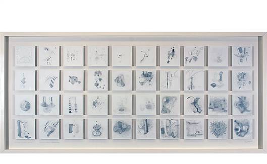
Kenneth Draper RA, Forty Days 10.10.2013 – 18.11.2013 : Reminiscences, Reflections, Echoes and Ghosts; I was astounded at just how many different marks the artist had made with a pencil.  I took me back to my earlier exercise as part of my Drawing 1 course, and I realised just how many marks I hadn’t made myself, or thought to have made.  Wispy tendrils, dots and dashes all combine to create soft tones, most of which possess an eery texture.  It appears as thought the artist interpreted a certain memory or dream from each day into a small drawing, before mounting them in this fashion to create an interesting collage.

Kenneth Draper RA: Forty Days 10.10.2013 - 18.11.2013 : Reminiscences, Reflections, Echoes and Ghosts, pencil on paper, 2013
Kenneth Draper RA: Forty Days 10.10.2013 – 18.11.2013 : Reminiscences, Reflections, Echoes and Ghosts, pencil on paper, 2013

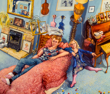
Anthony Green RA, The Faimly, Sherborne St John, oil on MDF; I don’t believe I have ever seen a painting such as this before, with such an extreme take on multiple perspectives.  I supsect this over-exaggeration is intentional, and that the artist was aiming for an almost panoramic view of the sitting room and its occupants.  I was unable to find a full image online, but there is this one detail on the artist’s own website.  I can relate to this piece; there are children present, Lego scattered all over the floor and what appear to be the parents presumably relaxing (or trying to) on the sofas.  Story of my life!  When looking closer, I noticed a figure reflected in the mirror that isn’t present in the composition itself; the artist perhaps, tucked in a corner painting from life?  The style is representational but with more excitement in the colours and mark-making with the brush that can be seen here in the sofa and the carpet.

Andrew Green RA: The Family, Sherborne St John, oil on MDF
Andrew Green RA: detail of The Family, Sherborne St John, oil on MDF

Ken Howard OBE RA, Double self-portrait, oil on board; without an image to refer to, it is rather difficult to point to why I like this work so much, but I’ll try my best.  The esteemed Ken Howard has produced a masterpiece with a diptych feel about it, a ground divided into two halves and each depicting a version of himself.  On the left, we have him in his youth, possible in his 20’s with a crop of thick brown hair and strong chin and shoulders.  On the right, the older version sees him with whitened unruly hair, ageing skin and a much softer bodily appearance.  The approach is not one as to create a realistic image but one that instils a certain energy in both faces due to the variety in colour and marks used.  I’m not sure of the execution of this painting, but it is certainly one that has made me think about a similar portrait of myself; perhaps one as a child, and one as I am now (I am only just into my thirties, so may have to wait a while for a white-haired version!).

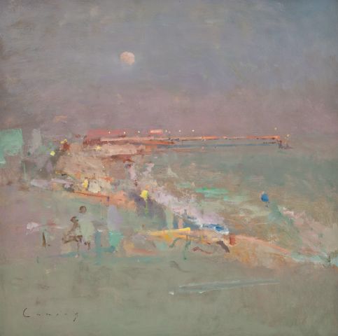
Fred Cuming RA, Cloud Studies (Camber and Rye); once again, I am unable to find an online image of these paintings but include here a sample of another of this artists work, to show his particular style (see below).  It seems strange that I am drawn to this artists work only to find out he trained in art in Sidcup, Kent – where I was born.  I love the way his work veers towards abstraction, and responds purely to the mood and atmosphere of the moment with vivid colour and bold brushstrokes.  I especially like his main subjects; paintings of the sea and cloud studies of towns along the east and south coasts of Kent, where I have spent many a childhood holiday.

Fred Cuming RA: Camber Sands, oil on board
Fred Cuming RA: Camber Sands, oil on board (example of work – not in Summer Exhibition)

Its perhaps not surprising that I was drawn more towards the paintings that have an element of ‘beauty’, or truth to them.  I understand abstraction and installation art as valid art forms (many works here were bordering on or firmly in either of these categories), but they are not my preferred genres.  Maybe I need to remove myself from my comfort zone and start dabbling with abstract work, possibly in the later stages of Painting 1…

References

http://www.kennethdraper.com

http://www.anthonygreen.org.uk

http://www.thompsonsgallery.co.uk


Research Point: Basics of Linear Perspective

  • Linear perspective creates the illusion of space and distance on a flat surface.
  • The horizon line runs at eye level across the canvas, to represent where the sky meets the ground.
  • Orthogonal lines connect points around the drawing to the vanishing point.
  • The vanishing point is usually located near the centre of the horizon line.  All orthogonal (parallel) lines run towards this.

I find it intriguing that even a master of drawing as advanced as Leonardo da Vinci would use pre-drawn perspective lines in his studies to help him position his subjects correctly.

Leonardo da Vinci: study for The Adoration of the Magi

Part Two: Project 4: Exercise 1 – Quick sketches around the house

I decided that my kitchen/dining room would be the most suitable choice for this exercise; it is more spacious and interesting than any other room in my house – and is also where a lot of my creative work takes place!  I began by standing and facing north-east, looking towards the door that leads into the hallway; this view is interesting in that it has depth, with regards to the turn in the hall and the stairs leading upwards.  I also like how my circular table cuts through the composition at the bottom-left corner.  I used a more defined line to suggest darker tones and shadows.

IMG_1385


I turned 45 degrees to face east after this, looking into the kitchen area containing detailed cupboard units and the cooker…

IMG_1386


…Next was the kitchen window, together with another wall that features a hand-painted clock and a photo frame…

IMG_1387


…and then I finished with the patio doors; quite possibly the least interesting view of them all, but this is what I arrived when turning 45 degrees.

IMG_1388


As with many of the exercises in the course, I tried not to concentrate on realistic detail in too much depth as not only did I not have the time, but also because I wasn’t sure yet which would be the best angle and I didn’t want to put too much work into those that would not come to fruition.  Personally, the view that speaks to me is the first, and will be the one I develop in the next exercise.  All of the drawings appear very ‘sketchy’ to me in terms of line quality, but the exercise served its purpose in helping me to identify the optimum viewpoint.


Research Point: Dutch Realist Painters

Although I wasn’t initially aware of it, this genre of painting is one of which I feel drawn to and enjoy looking at; cosy interiors, delicious food, raucous gatherings and people going about their daily lives.  This is an area I’d like to pursue in my personal paintings – but more on that another time.

This genre of art appears to have flourished in the 17th century, whereby a typical customer may be a factory owner, merchant or craftsman.  There were usually Protestant middle classes, desiring still lifes and landscapes that depicted their surroundings; the works of Vermeer and Rembrandt are strong representatives of this movement.

Patrons were often incredibly proud of their families and their homes, and were willing to pay often impressive sums in order to have them painted with the characteristic highly representational and polished finish.  These paintings provided an intimate ‘snapshot’ of a moment in time, and attention to detail was second to none.

Three paintings in particular from this genre that struck me were:

Gabriel Metsu Man Writing a Letter – a highly technical artist capable of depicting intimate interiors.  Lots of things struck me about this painting; the gilded frame, the corner of the room hidden in shadow against the sunlight wall, the sumptuous tablecloth and the serene look on the man’s handsome face as he undertakes a simple, everyday task.  The painting is almost evening split in its ratios of light and dark, which gives it perfect balance.  Perhaps the light falling on the face is a little exaggerated, but this may have been the aim in order to portray to the viewer just how engrossed in the task this young man is.

Gabriel Metsu: Man Writing a Letter, oil on canvas, 1662-65

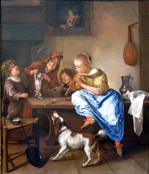
Jan Steen The Dancing Lesson – a curious subject for a painting, but nevertheless one that caught my attention.  I can almost hear the raucousness of the occupants of this painting, and can imagine the dog barking loudly while the girl in the vivid blue skirt plays the musical instrument to the poor cat (some kind of flute, perhaps?).  Steen has expertly captured the silky texture of the skirt fabric, as well as the stone of the walls and the wood of the table.  Colour is considered carefully here, as the cool blue is balanced by lots of its complementary – orange (and brown) – in the background.  These earthy colours lend a real warmth to the scene, which was not lacking in the first place due to the joviality of what look like a group of children (although the chap in the feathered cap looks more adult than the others).  An older man pops his head through the window and the carefully rendered expression on his face, says to me at least, “keep it down you lot!!”.

Jan Steen: The Dancing Lesson, oil on panel, between 1660-1679

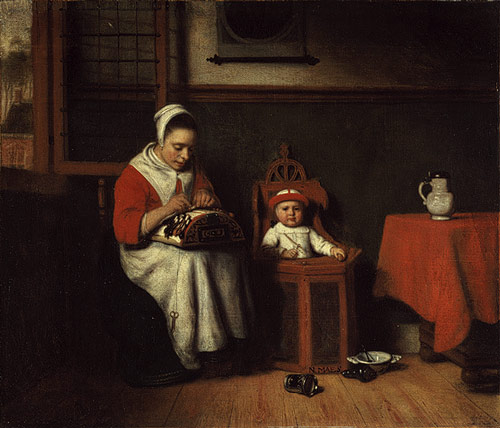
Nicolaes Maes The Lacemaker – I suppose what caught my attention here was the young child positioned inside what looks like a toilet of some description!  I can only imagine it is some kind of highchair, where he/she is placed while the woman works on her lace.  The contraption she uses is unusual, not something I have seen before.  The interior is dark and warm, with a limited palette of warm oranges, reds and browns that recede into darkness around the edge of the painting.  The clothing of the woman and child, as well as the crockery, are much lighter than their surroundings and serve to push them forward and mark them out as the important aspects of the paintings.  Just like Metsu’s Man Writing a Letter, the face here also is well-lit (although it is hard to tell where the light source originates from – probably not the window behind through which one can see a rather bleak-loooking landscape).  This helps to show the concentration and dedication to the task that this woman has.

Nicolaes Maes: The Lacemaker, oil on canvas, 1656-57

Resources


http://www.visual-arts.cork.com