I am pleased to have received a generally good report regarding my first assignment with the OCA; my thoughts and comments regarding it can be found in bolded italics throughout…
The first part of the course is about the core concepts of drawing – developing a repertoire of mark making, understanding basic shapes and forms and creating 3 dimensional effects.
Overall Comments
Well done Joanne, this is a very promising start to the course. You demonstrate good observational skills, confident use of materials and a strong sense of composition. Thank you for sending a well-organised assignment and learning log, it made it a pleasure to look at your work.
Your preparatory work is very promising, as here you allow yourself to be more fluid and expressive. Try to bring some of the spontaneity, freedom and life of your thumbnails and preparatory work into your final drawings. – I definitely agree with this; I do tend to find I indulge myself too much in recording the finer details in my finished drawings, and actually really enjoy how quickly I can work when undertaking thumbnails.
It’s encouraging to see you taking opportunities to experiment, for example, the finger-painted rose, this approach to trying things out in the moment, will serve you well during the course. I’ll be encouraging you to extend your repertoire of mark making and range of materials, and to take more risks to develop your creativity. – this I am most certainly looking forward to. The finger-painted rose was certainly a spur of the moment thing, coupled with a desire not to throw away unused paint. I loved how the idea came to me suddenly, and how easy it was for me to act on it.
The following comments on the projects are based on looking at the work online. (Next time can you send me a sketchbook) – I admit I was a little worried about sending sketchbooks as I try to work in them often, but will endeavour to send at least one of the three I work in when I complete Assignment 2.
Making Marks
Given your declared preference for pen/biro I’m pleased you went on to use charcoal for the reflected light project. I’m going to press you to spend more time with charcoal and wet media like brush and ink to expand your repertoire of marks, especially to make some discoveries by using media that you cannot control to the same extent as pen or biro.
I like your slightly free way with hatching; it keeps the drawings alive, try not to tighten up too much when you become more skilled. – I don’t like to admit defeat when something is getting to me, much like when I try my best to like using charcoal when in reality I find it slightly unpredictable and a little ‘clumsy’. However, I am not too proud to persevere with it, especially as there are so many types to choose from i.e. charcoal pencil, which can be sharpened to a point and is better for retaining more control. As for the hatching, I find that constantly changing the direction of the marks and keeping them ‘loose’ is a lot more enjoyable than having them too uniform and rigid. Its not a technique I aquired on purpose, it just came naturally to me! I am glad that it has a positive effect on my drawings.
Basic Shapes and Fundamental Form
You have a good grasp of shape and proportion and are able to distinguish and represent the relationships between different shapes and proportions.
Tone and Form
You understand how tone works. You could increase the depth of tone in your drawings to create more visual variety and interest.
In describing form you clearly enjoyed exploring through an unfamiliar method of making marks. You don’t make assumptions about what you’re looking at, generally you observe closely which results in objects looking individual rather than stylized versions of things we know. – I find that since beginning the course, I look at my subjects a lot more; I keep my head still and glance up and down between the object and paper constantly. I believe my observational skills have improved significantly since the start of the course.
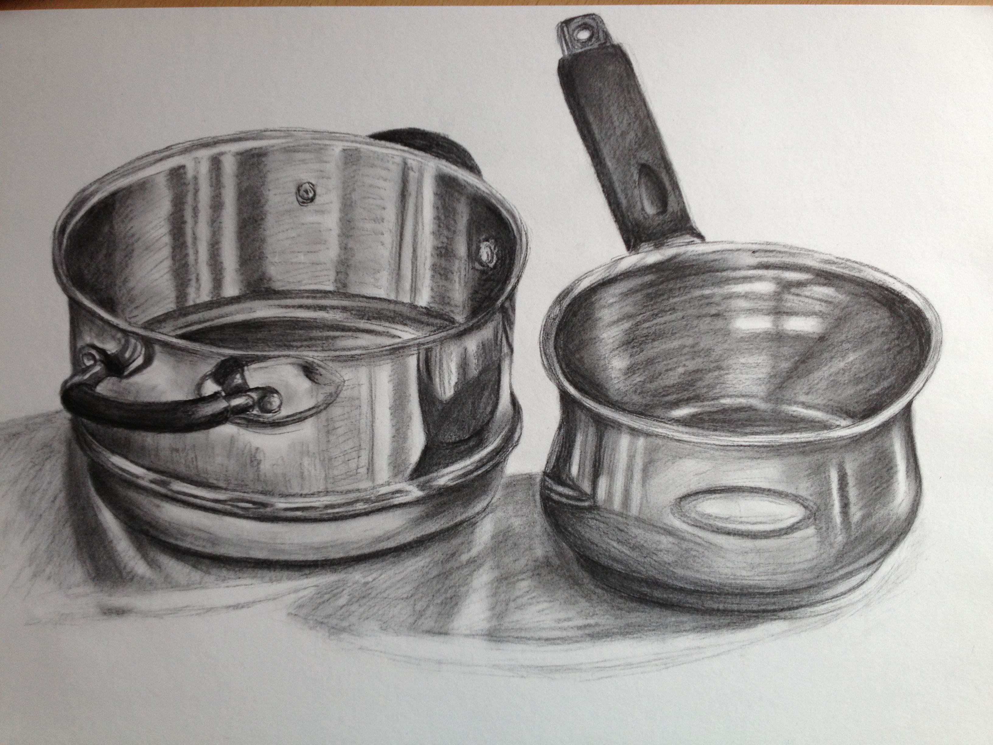
Reflected Light
Well done for producing closely observed reflections and for getting to grips with charcoal. As you say it’s a very response medium and you have used it fairly freely for this kind of work, when the temptation is to tighten up to get the reflections just right. From the photographs I can’t see enough to make a comment on blending – this was quite a large drawing, with the photograph not doing it justice; I must remember to send more originals in next time!
Still Life
You make good use of thumbnails, this is a very useful habit to get into particularly for exploring compositions and investigating details. I’m pleased you feel confident about making your own still life compositions and understand the difference a small shift can make. The same principle applies to selecting the frame for landscapes and anything else you choose the draw, the view is usually under your control and it’s up to you to find those that satisfy or excite you. – thumbnails were never really on the agenda for me before, when undertaking personal work, as I believed them to be time-consuming and only something that ‘proper’ artists did. I am obviously quite wrong, on both accounts; I find I can produce a thumbnail in a matter of minutes, and can see how they will prove useful when working towards any finished piece. I love how I can be spontaneous and experiment quickly with getting my ideas down; a bit like visual brainstorming.
Using Texture
I was pleased to read your comment – ‘I was feeling somewhat liberated by just how quickly I could render a drawing to convey texture without having to draw every single tiny detail I saw. It was certainly a revelation!!’ – this is a crucial learning point. Being able to work over the whole drawing, investigating what you see and developing the drawing as a whole, in it’s own right, if that makes sense. In the next assignment see if you can use different methods to create texture. – I am slightly obsessed with texture at the moment, which is also evident in the other OCA course I am currently studying (Painting 1: The Practice of Painting). In the past, I always used to insist on the tightest drawings to show every detail but found doing this produced inconsistencies where some areas would be rendered better than others. My aim now is to see the object I am drawing as a whole and work on it as such, and not just concentrate on any one area and focus on ‘suggesting’ the texture, as opposed to drawing it.
Feedback on assignment
Your first assignment asked you to produce two large drawings, a study of natural forms and a collection of man made objects. You were asked to use materials of your own choice and to experiment with mark making and composition.
Natural Forms
Your rendering of form and surface is skilled in your final drawings and your preparatory work Your thumbnails show you can
select what’s important and work with economy of marks to record the
key elements of composition. This is will be a great advantage in assignment
3 when working in the landscape. The final drawing is a curious composition, I like the close up view and the cropping. It is technically well executed but perhaps a little slick, partly the smooth paper and drawing style, a bit like an album cover from the 1980s. This is exacerbated by the colour balance which is awry, there is too much magenta and sienna. Compare it with the pencil study and see what you think. The treatment of the pencil study is a little freer, the shadows have a better colour and shape relationship with the objects, the rougher surface means there is no slickness. Without a magenta cast all over we get much more sense of three dimensions and distance. On the whole I think the study is better drawing, however both of them are skilled drawings. – I want to kick myself slightly regarding this piece; everything had gone so well until I fixed the final drawing. I used hairspray, and not a lot at that, misting it on from a reasonable distance. Almost immediately, I could see my colours changing; my shadows, which were a deep blue-purple, turned a magenta-pink and this in turn completely ruined the complimentary effect I had hoped to achieve with the ochres in the wooden table and natural objects. Therefore, I agree that the coloured pencil study is more pleasing to look at and gives a more accurate depiction of my chosen objects and the space they occupy. I shall now be doing more research into the type of fixative I use, however I was under the impression that hairspray would be fine…
Man-made Objects
A very interesting choice to draw some areas in colour and some in monochrome. On the whole I think it has worked and it is helped by your technical skill. You have clearly applied what you have learned from the projects, especially in the following –
1. The reflected light on the glass necklace and the drawing of the beads themselves.
2. Tone, including cross-hatching, to describe form.
What I think doesn’t work so well are the coloured light shadows on monochrome, the surface of the bag and scarf has disappeared. The similar treatment of surface for the bag and scarf and apart from the brush, the lack of darker tones. – again, in complete agreement; it was only upon looking at the drawing again after reading this comments that I can see where the choices I made were perhaps not the best.
As in the Natural Forms drawing I think there are aspects of the preparatory drawings that are more successful.
1. The charcoal treatment of the faux leather bag and thin scarf, in particular have a better range of tones and more sensual surfaces. I can feel the plumpness of the bag and the softness of the scarf – I can see that the appearance of the bag and scarf alludes to them being made from the same material, and the same colour, when this isn’t the case. I believe I got too caught up in the fine cross-hatching to notice this.
2. The small scale study has a strong sense of narrative and personality, we get the sense that these objects have been chosen by an individual getting ready to go out. There is real life in this study.
Sketchbooks
I was only able to see your sketchbook work in your learning log, please send me a sketchbook or at least some photocopies next time.
Keeping sketchbooks and a learning log is an integral part of this and every other OCA course, not only because they constitute 20% of your marks
In formal assessment but they are also an excellent way to see how you are developing.
Different people use sketchbooks in different ways. Some people carry them all the time and make observations about the world around them, others use them as visual diaries to record their thoughts and feelings, they can be used to explore ideas and compositions for larger pieces of work, for imaginative drawing and doodles, some people collage found material,
Learning Log
Your learning log is a place to record the development of your thinking, especially in relation to your progress on the course. This is the place to reflect on your drawing and your research, probably where you’ll record visits to galleries and your research (though these may be in your sketchbook). Most importantly this is where you make notes about your own work and what you are learning. It will help you and your tutor see your progression and development.
If you’re new to OCA courses, read your Keeping sketchbooks and learning logs study guide for further information. You may wan to combine your sketchbook and learning log in the same format.
What an impressive learning log! Good critical reflection and thorough analysis on the exercises and projects. This kind of learning log will support you to gain the most out of all your OCA courses and gives you the potential to make significant progress. – the learning log is a joy for me to complete, as I am an organised person (I like to think), and keeping a log needs a lot of organisation and technical skill! I feel that if I were to have produced a hard-copy log, the quality wouldn’t be consistent and I wouldn’t enjoy it as much.
Research into other artists – Don’t spend a lot of time on artists’ biographies unless it’s for your own benefit, it’s not a requirement for the course. Make sure descriptions of artists’ work relate to you own drawings and the project in hand. Concentrate on making comparisons between your work and theirs, observing their techniques and compositions and noting how you can apply what you learn to your own work. I am also interested in your surprises, disappointments and inspirations. – I will try my best to integrate these points into future research posts! I also now understand that I need to be able to link my research to work I am currently undertaking or hope to undertake, so that it is relevant to my learning.
Suggested reading/viewing
Have a look at Winifred Nicholson and William Scott for the different ways they deal with still life subjects. – I have made a note of these and will be researching them within the next couple of weeks.
I am pleased to see that you are looking at other OCA students’ blogs. Do go on the study visits if you have time, they are well worth it to see art in the flesh but also to meet students and tutors face-to-face. – I am in awe at some of the work – visual and written – produced by other students and find it a constant source of inspiration. I have also joined an OCA Facebook group and take great pleasure in engaging in discussions on others’ work and general thoughts regarding their learning journey.
Formal Assessment
I understand you are aiming for a Creative Arts degree. I will make a comment on your progress in the next assignment report. Please read the section on assessment in your Student Handbook. Your Assessment and how to get Qualified study guide gives more detailed information about assessment and accreditation. See the assessment criteria at the end of the report.
Pointers for the next assignment
In the next assignment you’ll be drawing a still life in colour. You need to show an understanding of the use of colour and a rationale for your choice of materials and techniques, as well as contining to apply your learning from assignment 1. – colour is an area that has become more and more intriguing to me as my artistic career progresses, and I have no doubt I’ll always be learning something new about it. My current favourite area is complimentary colour and how to utilise it to maximum effect. I look forward to the next part of the course and putting my existing knowledge into practice.
This is an opportunity for you to develop your techniques with laying down and over lapping colour, looking at relationships between adjacent colours and exploring the way shadows are not black but contain colours from the ground and the objects. – again, this is an area that I have learnt a lot about recently; I have been looking at the colour of an object and then using some of its complimentary colour in its shadow. I adore working in this way, and will do all I can to avoid black which can deaden even the most dazzling colours.
You have good technical skills but don’t let them dominate your final drawings. Keep investigating even, don’t tighten up at the end, keep the drawings alive. – this is probably the comment I will have at the forefront of my mind when working on future final pieces; I need to keep loose, not tight, and spontaneous. I am aware that my smaller colour studies for the natural and man-made final pieces had more ‘character’ and texture than my final pieces; I just somehow need to fight the urge to keep everything neat and orderly. I am really looking forward to working in colour for the next part of the course; I have noticed in the past that I am more likely to loosen up with colour than with pencil/charcoal as I am always excited about the ways colours mixed when applied spontaneously and freely on a larger scale. We shall see…