Category Archives: Project 4 – Drawing fruits and vegetables in colour

Part Two: Project 4: Exercise 3 – Drawing using oil pastel with Research point: Ben Nicholson

As I didn’t have the required coloured AND textured A3 paper for this exercise, I improvised a little with what I already had; I found a large off-cut of cornflower blue card and cut it down to size, before rubbing it over with some wire wool to ‘texturise’ the surface.  Et Voila!  It seemed to have done the trick…..

Apprehensive would pretty accurately describe how I felt when I came to this exercise.  I had rediscovered some oil pastels in my art kit but I must have purchased them  – no lie – over 10 years ago, back when I was contemplating art in sixth form.  They stayed in my art kit and were never used, and I cant think why.  I took a sharp knife to them and sliced off the ends to reveal fresh, buttery colour and hoped that they would work…

The objects I chose were a pineapple (first time ever drawing one), a red pepper, a sliced kiwi and a sliced lemon.  Being a bit obsessed with complementary colours, I purposefully chose a red pepper so that it would contrast with the various greens in the pineapple leaves and the flesh of the kiwi.  Inspired by the reference photo of another students’ work in the course book, I decided I would place my objects on a plate to create more interest and avoid using my kitchen table as a backdrop AGAIN.  I thought the plate would also continue the ‘circular’ theme, i.e. echoing the main shape of the objects placed upon it.

I arranged the pieces on the plate and moved around it, trying to establish some possible compositions.  The course book didn’t specify doing preliminary sketches but I decided I like to do this now to prepare for most of my finished drawings so therefore I quickly produced three different scenarios in my sketchbook, using a ballpoint pen.

IMG_9611


I settled on composition No. 3, simply because I found the viewpoint the most pleasing; I liked how the curve of the plate just passes out of view and takes up most of the bottom half of the composition.  In my final drawing, however, I decided to alter the position of the sliced kiwi, to create more of a negative space between it and the lemon.  To begin with, I selected pastels in the colours that were closest to my objects, and roughly drew their outlines.  It was at this point that I made a mistake when drawing the decoration on the plate (the inner blue ring, to the left of the kiwi), but I figured that the pastel was thick enough to be able to scratch it back a little.  This worked in removing the pastel but some staining was left behind.

IMG_9568


Next, I selected the darkest colours and started to roughly block in these areas using a hatching/stippling effect.  The pastels resisted a little – I wasn’t sure if this was due to quality or age.  I found that the more pressure I applied, the better the result!  Except my arm became tired quite quickly…For the blue plate, I did what the course book suggested and overlaid another related colour i.e. purple over blue.  I found this gave the shadows a much richer feel and added warmth, as opposed to if I had used black.

IMG_9569


For the remainder of the drawing, I didn’t adopt my usual method of working from dark to light, or vice-versa; I simply worked over and over the drawing, building up layers where I saw appropriate, and I found this very liberating.  I was amazed at how much I enjoyed the spontaneity of the pastels and how all of the marks I put down seemed to fit perfectly.  I saw many colours in the pineapple, for example, such as purple and light blue, but worried that adding these would make it look surreal.  I needn’t have worried, as these colours seemed to belong where I put them.  The course book mentioned leaving the ‘white’ to show through, despite having had to choose a coloured paper; I assumed that this simply meant let whatever support you had used to break through in places, and I feel I achieved this, not least because this seems to be a natural outcome anyway when using oil pastels.

It occurred to me that it was almost impossible to make a ‘mistake’ as the colours and marks I made harmonized together to create – what I felt – to be my most experimental drawing to date.  This was my first drawing using oil pastels, and I was left wondering why I had been so afraid to use them in the first place.  I was expecting to take hours on this piece, building up the layers, but instead spent a rather pleasing two hours or so layering on luxurious colour and enjoying every minute of it.

Final Drawing
Final Drawing

Research Point: Ben Nicholson

I adore having to research an artist I haven’t previously heard of, and Ben Nicholson is no exception.  I somehow envisaged a more recent artist, perhaps still alive, but maybe this was due to his rather modern-sounding name.

Ben Nicholson OM – which I discovered stands for Order of Merit (for great achievement in the arts) – was born to two artists, which must have had a great deal to do with his following the same career path.  His early paintings were influenced by his father William Nicholson’s work, a master of subtle tones and light.
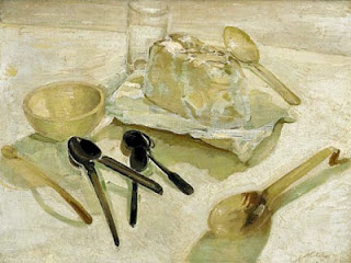
William Nicholson: A Scottish Still Life, 1931
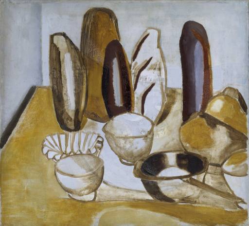
Ben Nicholson; Bread, oil on canvas, 1922
Ben Nicholson: Bread, oil on canvas, 1922

Comparing Nicholson’s Bread with his fathers’ work A Scottish Still Life, one can see certain similarities, such as the tonal shading inside the bowls.  However there is not much else to tie these two works together, as Bread is a more abstracted approach that sees him flattening his objects so that some are almost unrecognisable (the statue-like breads, for example, that seem to be stacked on top of the other objects).  His use of colour is also rather harsh in comparison, applying it with thick, bold brushstrokes.  This is a rather early work, which sees him moving away from the more regimented, academic practice of painting and taking inspiration from Post-Impressionism and Cubism.

During the 1930’s Nicholson adopted an extremely abstract style, producing a series of relief pieces, mostly in white.  When he moved to St Ives in the late 30’s with his second wife, sculptor Barbara Hepworth, he began to work once again on landscapes as his dealers considered these easier to sell and he was able to make something of a living.

Ben Nicholson: St Ives, Cornwall, oil and graphite on canvas, 1943-5

St Ives, Cornwall features a Union Jack to celebrate V.E (Victory in Europe) Day on 8th May 1945, which suggests it was a late addition to the painting given the timeframe of its completion.  This is a curious piece, with all objects flattened except for maybe the boats in the distance that have a more solid appearance.  The cups/mugs on the windowsill appear as though from the pages of a pop-up book, looking fragile and like they could blow over with the slightest gust of air.  The elements of the objects all seem to intertwine and become a whole, as opposed to separate pieces.  This painting was one of a series, and allowed Nicholson to revisit his experimentations with objects and their positioning in space from the previous decade.

Ben Nicholson: Still Life, oil and graphite on canvas, 1945

Still Life is an example of extreme abstraction, depicting a completely compressed table with objects that appear enmeshed within it.  The colours in his subtle palette, most notably the white and red, were ones he favoured in the early post-war years and were understandably used to distinguish certain objects from the others surrounding it.  It has an almost collaged feel, as though each of the elements has been torn or cut from an entirely different piece of paper and stuck back together in a haphazard manner.

The course book asks “Why does he simplify still life forms and negative space and superimpose them on the Cornish landscape?”.  There is also a reference picture of Nicholson’s Four Pears that apparently has the suggestion of a landscape behind it; I personally cannot see this, however it may be very subtle.

Ben Nicholson: Cornish Landscape, oil ad pencil on canvas board, 1949

Perhaps the one painting that illustrates this best to me is Cornish Landscape, where ghostly, transparent  objects are suggested through the clever use of line that incorporate themselves into the landscape behind it.  My one theory as to why Nicholson began this practice is simply that it was a progression from his earlier works that featured the windowsill and perhaps a tabletop, whereby he completely did away with these ‘barriers’ to merge the elements together into one entity.  The result is most certainly experimental but at the same time an acquired taste for those who are used to viewing still life and landscape paintings with clearly defined boundaries, forms and tone.


References

http://www.tate.org.uk

http://www.kettlesyard.cam.ac.uk

http://www.bbc.co.uk

Check and Log

Your composition should occupy most of the paper’s surface.  How much negative space do you have left?  

I think I have done quite well here in striking a pleasing balance between the objects and the space they occupy, and the negative space.  Negative space is only visible in the four corners of the drawing.

What have you learned from drawing the details of the fruit and vegetables?

All fruit and vegetables have a distinct, individual texture and it is wise to consider what drawing implement and technique you will use beforehand so that you can represent its appearance in the best possible way.  I’ve really enjoyed looking at different kinds of produce, especially the pineapple in my oil pastel piece;  I have never before drawn so many fruits in such a short space of time and rather than wanting to move on, I’d quite like to do more.

What did you find most challenging about this part of the course?

Trying to find a composition that wasn’t too similar to one I’d done before; I had to try hard not to put objects in the same place, or the same groupings.  I was also conscious that I couldn’t afford to keep replenishing my stock of objects, therefore had to make use of what was in my fridge/fruit bowl at the same.  The same red pepper made many appearances!


Part Two: Project 4: Exercise 2 – Using markers or dip pens

I panicked a little when I read the instructions for this exercise; use dip pen/ink AND marker pens – together?!  Obviously something I’ve never attempted before, going on that reaction.  I admit to looking at other students’ blogs to see how they tackled it, and this gave me some inspiration and momentum to get going.

I had to purchase Winsor & Newton inks and a dip pen specifically for this exercise, and as money is a little tight I had to restrict myself to just three colours; red, blue and yellow (so, primaries), thinking I could mix multiple colours with these.  I purchased some Crayola Supertips markers also that have a special tip that you can use to make thin and fat marks and washes of colour, to use alongside my existing Pentel fine point fibre-tipped pens.

My objects were half a melon, two strawberries (one large, one medium), an over-ripe banana and a satsuma that had been peeled and separated.  Instead of the kitchen table as a background (at last), I  used a pale turquoise tea towel that I proceeded to bunch up to create interesting folds and dips.  I grouped them all together and when I had found a good enough composition, I set about drawing it.  My first piece was portrait-orientated, and was drawn almost entirely with markers and employed, mostly, the hatching technique.  I began with a rough outline of the objects, followed by gradual layering of the colours from light to dark.  I enjoyed using some rather intense colours, such as the vivid orange that really jumps out from the turquoise surroundings.  What got me here was that I couldn’t find an exact match to the tea towel so the hatching appears a little ‘harder’ than intended.  I didnt want to just ‘colour in’ like I would have done as a child, therefore rendering the bumpy surface of the strawberries proved difficult as I wanted to leave some areas lighter to suggest light hitting the surface.  For some reason, I decided it would be a good idea to try and soften some of the hatching on the tea towel when everything else was finalised, therefore I took up my water brush pen and washed over some of these lines.

IMG_9469


For the second composition – again, portrait-orientated – I used both dip pen and ink and markers.  I began by mixing the ink to produce a colour that I could use to roughly draw the outlines of my fruits (i.e. blue and yellow together to make the green of the strawberry leaves).  I found the dip pen a little scratchy and producing only very fine marks, but I was determined to carry on with it to see what the possibilities were.  One of the more enjoyable ones was the ability to flick the pen and produce a pleasing spattering of marks that weren’t far off the appearance I was trying to achieve i.e. the speckled skin of the banana.  Rather than mixing a brown here, I just used blue straight from the jar and was pleased with the result.  Once the main shapes were in place I used the Crayola Supertip markers to build up the intense colours and marks, once again feeling a wash over with my water brush pen would finish it off nicely.

IMG_9470


Lastly, I put together a composition that called for a landscape-oriented piece.  This time, I was conscious of letting the inks cover most of the paper as opposed to the markers.  As before, I drew the objects with dip pen and ink, but then used a small, flat brush to apply ink straight from the jar or palette (if mixed) in a kind of rapid, preliminary wash.  To soften these inky washes, I went over them with my water brush pen, and then once dry I built up the colours with a select few markers.  It was obvious that the inclusion of only a select few markers meant this piece felt a little more sombre.  Perhaps this also owed to the fact that I was using a restricted palette of inks and wanted to reduce the use of markers, which naturally carry the more intense colours.

IMG_9471


For my final A4 drawing on cartridge paper, I opted for the third composition; however, I wasn’t happy with the tight grouping of fruits in the top-left corner therefore moved the medium strawberry to the bottom-right to balance it out.  I chose to use ink for the preliminary drawing, and also to create subtle washes of colour before layering the markers – and more intense colours – over the top.

IMG_9496


The process began well, but as the markers were layered I was aware that the drawing was becoming a little too ‘graphic’ and bold, perhaps almost with unnatural colours.  I’m not sure whether to blame my limited palette of both inks and markers, or my lack of skill in this area.  Perhaps my favourite part of the final drawing in the banana; the markings are convincing, and the fruit itself is not unnaturally yellow.  The strawberries and satsuma, on the other hand, are extremely intense and I feel these are a little overworked with maybe too many overlaid colour (something the coursebook warned about….).  The tea towel has once again ended up darker than it really is but I feel it need the extra depth of colour to stand up well against the colourful fruits, otherwise it would have appeared quite dull.

Final Drawing - A4
Final Drawing – A4

If I were to do this exercise again – and I may well come back to it if I find the time in my hectic schedule – I will take care not to build up too many layers in a bid to successfully render the shape and form of the objects.  The satsumas didn’t need so much deep red, and the strawberries certainly didn’t need the dark purple.


Part Two: Project Four: Exercise 1 – Using hatching to create tone

Being quite a methodical worker in my sketchbook,  I was somewhat delighted to be instructed to draw the pieces of fruit  and veg individually.   I dedicated a page to each in my A4 sketchbook, using charcoal to create the tone using a hatching technique.  I chose a sprouting garlic bulb, half a red pepper and a courgette; I figured that the complementary green and red would work well.

The structure of the garlic bulb called for the use of long, directional marks to suggest the brittle and transparent skin.    The sprouts (from being stored in my cupboard far too long) were not consistent and reached in all directions, possessing a waxy sheen.  On areas where the light hit, the skin was far more luminous than in other places.  I liked how the skin concealed the multiple cloves of garlic inside, whilst still showing their actual shape on the outside.

IMG_9354

The inside of the red pepper was rather strange; the walls of the ‘cavities’ – as I like to call them – were very dense and the surface of the flesh had a wavy pattern that was suggested with short, curvy marks.  Where the pepper had been sliced in half, the walls of its structure showed fibrous, closely packed flesh that gradually lightened in tone from outside to inside.   The central mound that contains the seed is quite sponge-like, and it was rather enjoyable to suggest the texture with various dots and dashes.  The scattering of the seeds and the texture of the flesh within seemed very random, therefore it was also a challenge to draw.

IMG_9355

I had to be careful with the courgette, to ensure it didn’t resemble a cucumber due to its similarity in shape, size and colour.  I was sure to study its waxy skin closely and pick out the dark masses within its tightly flecked and lined skin – something a cucumber doesn’t possess.  To depict its curious patterning, I used short sharp marks and varied the pressure at intervals to create different tones.  I decided to slice the courgette in half and study its inner flesh, and found, much like the red pepper, that the flesh gets less dense the closer to the centre it is.  I found more spongy flesh, once again easily represented by various size of dots and dashes.

IMG_9356

I had already decided that I wanted to explore the pieces from an extreme viewpoint, so I played around with a few scenarios.  No. 1 was an almost eye level approach, with the garlic being in the foreground and the other objects receding into the distance.  I wasn’t happy with this in hindsight, as there appeared to be too much darkness on the right-hand side, which was making the composition appear a little uneven.  No. 2 sees the objects just below eye level, and more closely grouped together.  The tone is more evenly distributed here as the shadow of the garlic balances well with the dark tone of the courgette.  No. 3 was viewed from directly above, which produced an interesting arrangement but not much excitement in terms of depth in the picture plane.  I decided to develop No. 2 further for my final drawing.

IMG_9357

I told myself, just before starting, that I wasn’t to get too tied up in detail and to employ a loose approach which is ever so enjoyable when using the hatching technique.  On my piece of A4 cartridge paper, and using pastel pencils, I began with mid-tones on all of the objects, careful to leave lighter areas untouched for highlights.  I built these up gradually, overlaying colours such as the blues and greens on the courgette for interest.  Then the lighter tones were added in, followed by the darker tones.  I was struck by just how many colours I could see in the skin of the garlic clove.  I admit to using black in my shadows, however this was overlayed with other dark colours such as blue and brown to avoid any ‘flatness’ that would detract from the overall piece.  I worked rapidly, almost in a circular motion around the piece, revisiting the objects over and over until I was satisfied that a) I had employed the hatching technique consistently, and b) that my colours were as accurate as possible but  also interesting.  Perhaps the one element I am not so happy with is the table; below the courgettes, it is cast in shadow and looks convincing, but above it – the lines just appear to ‘float’.  I did try and show the difference in tone of the wood, but it hasn’t quite turned out the way I wanted.  Wood grain is a material I need more practice with, I believe.

And yes, it is the same table that has played a starring role in most of my still life set-ups recently; I am still trying to find an ideal solution in this hectic household where I can set objects up and not have them interfered with! (other than the trusty kitchen table).

IMG_9353