Category Archives: Coursework – Drawing 1

Response to Tutor Report for Assignment 2

My comments on the report are bolded italics… Part 2 is about the close observation and interpretation of nature, paying attention to detail, working both expressively and more tightly, using colour and a range of media. Being able to look closely and analyse what you see will help you select the most appropriate tools and techniques to reposond to your subject matter. At the same time you will be exercising discernment about what is essential to include in your drawing and what can be disregarded. Being able to do this is key to making a sucessful drawing, it comes with practice. You were asked to use strong directional light to define forms and highlight details and textures.

Overall Comments

Well done Joanne, you have produced good work in all the areas above and I continue to be impressed by commitment given the fact that you have three small children. Your sketchbook and learning log show the quality of your preparation, reflection and analysis, which is admirable. – yes, doing the course is hard- and slow-going most of the time but I have sufficient support in place! I am naturally very organised and like this to be reflected in my work.

Your observation of form, surface, proportion and relationships of objects is very good. You use of colour and composition is effective. You are often too reliant on your technical skills and producing an ‘accurate’ observation rather than a drawing in its own right. All drawings are journeys of discovery and if the viewer can sense this journey, with it’s meanderings and getting lost, it makes a drawing more alive. – I think that there is still a way for me to go yet before my drawings really loosen up, and I wish I did find it easier, but I continue to push my boundaries and have dabbled in some media that I’m not particularly fond of, in the hope I can create work that is more spontaneous.

You need to explore a ‘felt’ or ‘kinaesthetic’ sense in your work. Be more confident about building on your sketchbook explorations. Now is the time to trust in your skills and find ways of bringing a more intuitive response to your subject matter into your finished drawings. Give yourself permission to play on a larger scale. – I completely agree! There will always be a part of me that wants to stick to a rigid way of working, but I do like the thought of working to a larger scale with my explorations. I guess the reason I do most of my experimenting in my sketchbooks is so that everything is in place; of course, this doesn’t always have to be the case.

Exploring coloured media

You demonstrate a confident and selective use of colour in your drawings but your should expand your materials and media. – I have become more aware of the suitable use of colour through my own studies/reading, as well as through the course, and have been happy with the choices I have made. However, I do agree about expanding my materials; oil pastels are slowly working their way back into favour, and I’m hoping to include more pen and ink work in future also.

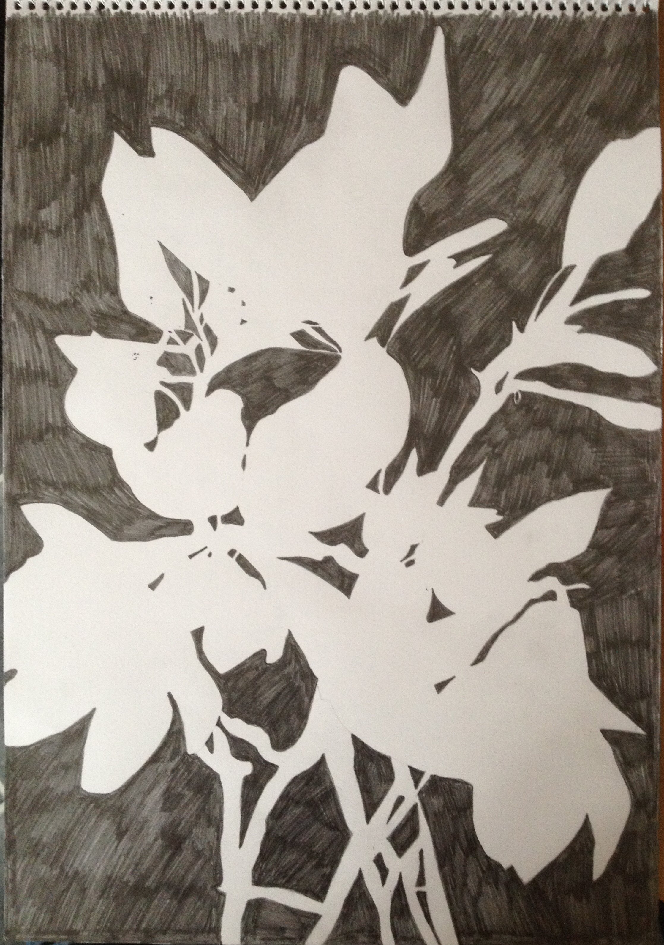
Detailed Observation

Very well executed and observed drawing of leaf. You have combined technical skills – detailed observation with a range of marks and tones and kept the drawing vibrant. – I am happy also with my observational skills, but I feel I need to ease up on the technical side of things in the majority of my work, to create drawings that are more ‘alive’ (as mentioned before).

Still life

Ex.2 An interesting exercise with complimentary colours. There are areas where it’s difficult to read the objects as they merge with the shadows particularly on the left-hand side. I appreciate there were strong shadows but more gradation of tone with the purple or a blend of purple with the other two colours would have reduced its dominance. The colour blending of the yellow tones and description of different surfaces is successful. – if I am honest, in hindsight, I wasn’t overly happy with this piece; in my sketchbook prep work, the colour scheme appeared to work, but just not how I used it! I think I stuck to rigidly to what was outlined in the course folder (another of my ‘bad’ habits) and could have maybe tweaked things here and there so that the outcome was more satisfactory.

You were asked to use a strong directional light which is shown by your shadows but there aren’t any real highlights. There isn’t enough difference between the detail in surface of the orange close to us and the apple further away to create a sense of distance. The same strong purple colour in the foreground and background also flattens the perspective. – once again, I agree; next time I attempt an exercise such as this, I will be careful to vary the strength with which I apply the colours, to create a sense of depth. Drawing fruit and vegetables in colour

Ex.2 Good colour combination, nice loose mark making and well done on the very subtle lines on the banana. You might have been better off limiting the red as it makes the surfaces of the satsuma and melon rather similar. See your sketchbook drawings where the fruit are more differentiated. – I was aware, after application, that the red was somewhat overpowering; I would have been better off diluting or lightening this for the orange.

Ex. 3 The coloured card deadens this drawing and unfortunately undermines the careful work of describing the fruit and vegetables. – I’m a little disappointed by this, as this was my first attempt in a very long time at using oil pastels! And as I understood it, the course folder called for a coloured ground. I figured that using the pale lilac/blue would act as a complementary to the lemons and orange-red of the pepper. I guess I need to experiment more with the effect certain oil pastel colours have on coloured grounds. Drawing plants and flowers

Ex. 2 You have clearly taken a great deal of care over this drawing and your skill is apparent. I like the visual interplay shadows on the plants and the wall and the striations on the plants, these are well observed. The shapes, proportions and relationships are all convincing and carefully executed. At the moment the drawing is leaning more towards 2D pattern than 3D form, a bit like a botanical illustration or textile design. It needs more substance. To bring the flower heads to the fore a greater range of tones would make a difference, darker darks and lighter lights. I would have liked to have seen you bring the vibrancy of the coloured pastel, ink and felt tip pen drawing of the flower head in your sketchbook into this drawing. – once again, my close observational skills have gotten the better of me! I interpreted the plant just as I had seen it, and yes, I could have played around with lights and darks more in the flower heads to make them advance from the rest of the piece. I did, however, study the very subtle tones that were present and worked hard to incorporate all of these (pinks, greens, blues, yellows) whilst achieving a realistic effect.

Drawing Animals

Fish on a plate. Good to see you loosening up here. You could go over the washed pencil with another subtle layer of pencil to bring the pull the drawing together. Make sure you pay attention right to the edges if you don’t want a fading out effect. – I admit to feeling a little out of my depth and also quite frustrated with this one. I’m not very experienced with watercolour pencils and felt that the addition of water after the initial drawing undid all the good work. However, I did find that reworking certain areas with pencil or ink helped to strengthen it and towards the end I felt much better about it.

Grabbing the chance. Lovely free mark making in the sketches. Again it’s good to see you working loosely and at a larger scale. I know this was drawn from a photograph but you have managed to give the cockerel some life. I think the sketchbook version is even more alive. – I would have loved to have drawn from life, but the opportunity just didn’t materialise! Luckily the photographs I did take were full of lots of movement. I wanted to do my chosen image (and the cockerel!) justice with my final drawing and I really consciously tried to keep the mark-making very gestural and loose, with lots of interesting colours.

Feedback on assignment

Assignment two asks you set up a still life of largely natural objects, contrasting in size, shape and texture. You are required to be selective in your choice of objects, not cramming in too many and removing those that do not contribute to the overall composition. You were also asked to use a strong directional light, natural if possible otherwise using a lamp. You say that the subjects depicted were not your first choice, this may be an advantage in that you may be less attached to them and more able to see them more objectively.

Well done on the thorough preparations made in a range of media, these are almost art works in themselves. – wow – that’s great to hear! I do like to take a lot of care in my preparatory work – something I never used to do before undertaking a large drawing.

Your final drawing shows a dynamic composition that makes effective use of negative.The interplay of colour the blue green of the vase and yellow green of the pairs works well. Biro used on top of another medium can draw attention to the fact that a drawing is just marks on a surface and undermine the three dimensionality of objects, especially if used to outline. See the difference in the pears and the bag flap in in the small scale study and assignment drawing. – I had begun with a biro underdrawing before using the watercolour pencils, but it appeared all but washed out once I had finished adding colour. But then, once I had drawn back over my original marks, I thought the same; its too strong. Perhaps one saving grace was that the biro was blue, and not black! I shall certainly bear this in mind for future. I guess what I thought at the time was, this is a pen and ink drawing, so the ink should be showing somewhat!

Sketchbooks

Excellent preparatory work. I am encouraged by your explorations like the third marker or dip pen drawing in A3 sketchbook. There some very direct and responsive drawings in your A3 sketchbook, try and bring this direct response to subject matter and range of mark making to your finished drawings.

Be careful of making your sketchbook pages too precious at the cost of free exploration. In the future I would like to see you doing some preparatory work on a larger scale, using brush and ink, charcoal, pastels. Your A2 pastel of the cockerel shows that you can work in a spontaneous way at this scale. – this is a tough one for me! I am aware that I keep my sketchbook pages can be too ‘neat’, and will actively work at letting go of this as time goes on.

Bring more play into your sketchbook activity. – I will certainly try!

Learning Logs

A comprehensive learning log with relevant research into masters and contemporary artists. Apart from continuing to develop your drawing practice think about what you want to explore through drawing. What concerns might you be able to express through this and through painting? – interesting question, one I’ve never thought about before…

Suggested reading/viewing

Have a look at John Virtue’s bold black and white landscape work.

Bonnard’s mark making and colour in his landscapes and interiors.

William Kentridge’s drawings of trees.

John Piper’s atmospheric descriptions of architecture.

Eric Ravillous’s almost childlike landscapes.

George Shaw’s naturalistic descriptions of places without people.

19th century Dutch landscape painters for their clouds and skies.

Assessment potential

I understand your aim is to go for the Creative Arts Degree and that you plan to submit your work for assessment at the end of this course. From the work you have shown in this assignment, and providing you continue to commit yourself to the course, I suggest that you are likely to be successful in the assessment.

Pointers for the next assignment

Part three is about getting outside and drawing the world around you, an enormous source of inspiration; however your assignment drawing uses A3 paper and therefore requires you to think carefully about selecting what you want to include and leave out. Pay attention to composition and perspective with plenty of quick sketching both to explore whole compositions and important details.

1. Do some sketches with charcoal and/or ink on A2 sheets, just relax and respond to your surroundings. Fortunately we’re coming into summer so you can do this outside.

2. Try to express the atmosphere of the environment you’re drawing.

3. Carry around a small sketchbook and do lots of quick sketches when ever you can.

4. Try collaging newspaper, print from magazines and other monochrome paper to create distance in landscape, individual and groups of trees.

Assignment 2

Unfortunately, my assignment 2 didn’t get off to the best start due to my rather small collection of natural objects being ‘accidentally’ disposed of by another family member.  I tried to take this as a positive sign that I should think creatively about alternatives, however I’m not sure my final choices are exactly along the same lines as what I had gathered previously.  The rhododendron bush in my garden has fully bloomed now, so I took a small cutting of this, and rummaged in my fridge for edible natural objects.  I came across two pears with distinctive markings, one of which was slightly bruised and on the verge of rotting at the very bottom!  I also selected a textured turquoise vase and a faux-bronze effect clutch bag with intricate detailing.

The course book asks us first to select media for the drawing, which I thought was odd as I hadn’t yet experimented with compositions.  I chose both pastel pencils and watercolour pencils, along with ink and biro, and tested ways of expressing the objects’ colour on a A3 sheet.  Pastels, I feel, are always a great choice for subtly blending colour, but after I drew the pear (top left) I was sure I didn’t want to go down this route, as I was after more vibrancy in my colours.  The ink and watercolour pencil version of the pear showed promise, as I was able to render some of the more distinct detail as well as crisp colour.  I continued down the page, drawing each of the separate elements of the still life in colour; although I don’t normally work in this way, it was almost as though my thought process evolved as I went, with pastel pencil being gradually phased out until I had settled on biro and watercolour pencils at the very bottom.  I had been conscious all the way through of not wanting to revert to the ‘safe’ materials I was more comfortable with, deciding instead to go with the one that I was least comfortable with, with a view to stepping out of my comfort zone and being spontaneous with my mark-making and colour choices.

IMG_0683

I wanted to familiarise myself with my objects and their ‘feel’, therefore I conducted some tone and textural studies in charcoal on an A3 sheet.  The speckling on the pear lent itself well to being represented by charcoal, however all of the other objects were smooth and required some blending to achieve the desired textural effect.

IMG_0681

Next, a suitable composition was required that would do justice to the shapes, textures and colours of the objects I had chosen.  I was quite aware from the beginning that the turquoise glass vase was complementary to the bronze-effect bag, and this made me want to take it further, resulting in a corner of my bedroom being used for the set-up; this was due to the overhead light being very orange-toned, and the wood of the  bedside table is also a very warm hue that looked good against the glass.  It is suggested that something be added for contrast, therefore I believe the vase does the job.  Due to circumstances that meant I wasn’t able to comfortably set up a still life in natural lighting, I opted to use a lamp instead (as well as the ceiling light, dimmed a little), which threw some interesting shadows as I moved it around.  Try as I might, I just couldn’t see a suitable. landscape-oriented composition that worked, therefore all of those I roughed out were portrait.  I worked quickly in black biro while I had someone stand and hold the lamp in place.  I struggled to chose just one from the five, as they all had their merits, but no. 4 was the composition I settled on, as I liked the way the lines interacted with eachother; the lines of the bag and the upright pear run almost parallel, as do the lines of the pear on its side and the surface of the bedside table.  I also like to let objects run outside of the picture plane, and here it is the edge of the bag and the tips of the leaves, at opposite corners of the drawing for balance.

IMG_0782

Something I always find rather helpful now is the small-scale colour study; I felt I needed to do this as there were some curious colours in the composition that I wanted to get down on paper.  For this, I used a light orange toned paper as it is one of the main colours of the composition and a complementary to the turquoise glass, and drew with pastel pencils.  I roughed out the objects in a sepia tone, before adding light colours and building up to darker ones.  The curtains in the top portion of the background are cream but had some dashes of lilac here and there in the shadows, plus the pears – that may appear just a dull green – seemed to take on all manner of shades such as yellow ochre, terracotta and crimson when in shadow.  I was also intrigued by the beautiful, rainbow-like reflections on the bottom part of the bag, which was reflecting everything around it.  I blended as I went as the tooth of the paper gave it a texture that made it difficult to gauge the colour mixes correctly.

Something I always find rather helpful now is the small-scale colour study; I felt I needed to do this as there were some curious colours in the composition that I wanted to get down on paper.  For this, I used a light orange toned paper as it is one of the main colours of the composition and a complementary to the turquoise glass, and drew with pastel pencils.  I roughed out the objects in a sepia tone, before adding light colours and building up to darker ones.  The curtains in the top portion of the background are cream but had some dashes of lilac here and there in the shadows, plus the pears – that may appear just a dull green – seemed to take on all manner of shades such as yellow ochre, terracotta and crimson when in shadow.  I was also intrigued by the beautiful, rainbow-like reflections on the bottom part of the bag, which was reflecting everything around it.  I blended as I went as the tooth of the paper gave it a texture that made it difficult to gauge the colour mixes correctly.

IMG_0779

Once I was satisfied with this composition and the colours, I selected an A3 sheet of thick cartridge paper.  First, the composition was drawn in with biro; this part was most enjoyable as I find that any mistakes you make drawing with biro are ‘happy’ ones, as they never really look that out of place.  I also love the spontaneity of it, and the fluidity with which the tip moves over the smooth paper.  The detailing on the bag was a real challenge, but I didn’t want it to look like a ‘design’ drawing, so I tried to keep up the spontaneous marks and didn’t think too much about getting it completely symmetrical or perfect.

IMG_0735

Since my last use of watercolour pencils had me a little frustrated (fish on a plate), I expected to fight with them a little here.  I aimed for the same approach – layering colours, starting with the lightest – however I found even some of the lightest ones turned a little too dark when water was added (the lilac in the curtain, for instance).  Since completing this piece, I have come across an article that suggests creating a colour chart of all your watercolour pencils when water is added; I WILL do this in future!

IMG_0760

Some parts of the drawing I aimed to keep white, like here where the pears are hit by the light.  I added a base colour of lemon yellow and then built the layers of other colours around it, taking care to preserve the white of the paper.

IMG_0761

Once I had most of the colour on, I went back over the whole drawing making sure it worked tonally, and darkened certain areas by layering more colour, such as the shadows in the leaves and the cast shadows on the wall and bedside table.  I was aware that the boldness of the original drawing had been lost, so I strengthened the lines by drawing over them again – not perfectly, but almost, once again to add some movement and spontaneity.

IMG_0777
Finished drawing – biro and watercolour pencils on A3

Reflection

So, looking back at the criteria, I have to ask myself if I have satisfied them with this assignment…

  • an understanding of the use of colour in drawing – I am certain that my colour choices are true to those I saw in my chosen objects, albeit it maybe ‘heightened’ in places to achieve a more striking effect i.e. the colour of the glass is a very bright turquoise in the drawing, when in real life it is less though.  I was of the understanding that tweaking colours for the good of the drawing wasn’t such a bad thing, and I’m glad I did so in this case.  Also, I was working with a slightly limited palette of colours and was pleased that I managed to ‘mix’ this particular colour on the paper using what colours I had.  I also would hope that my knowledge of complementary colours was applied well with the selection of the objects and their surroundings.
  • an understanding of the most appropriate choice of medium for the subject and skill in using it – the objects I chose do, I feel, lend themselves well to being drawn in watercolour pencil.  Take for example the delicate vase; this may have appeared quite heavy and ‘clumsy’ if drawn exclusively in pen, or very thick pastel.  The watercolour pencils have a certain fluidity that represents glass rather well.  The colours of the reflections in the bag are also quite subtle but at the same time rather crisp in appearance, and I was able to render these successfully with the use of my fine water brush pen.  With regards to the skill in using watercolour pencils…I believe I have more practice to do with these, but at the same time I am happy that I turned my back on my usual choice and threw myself into being completely and utterly experimental and spontaneous with these pencils.  Although I did a colour study in pastel, which did help, my selection of colours in the final piece were almost intuitive and I actually worked rather rapidly.  This is a way of working that I could get used to.
  • the ability to set up and interesting composition – as can be seen in many of my other drawings, I am rather fond of extreme angles and try and achieve them where I can.  In this instance, I hit upon a composition that had interesting line relationships, such as diagonals, going on between certain objects.  Sometimes this can be accidental, but in this case it wasn’t.  Together with the objects beyond the picture plane at opposite corners, I feel the composition really works as a whole.
  • variety in mark-making, depth, contrast and tone – hmm, mark-making – I think I am a little guilty of getting carried away with colour here and not using enough marks.  Perhaps the best example of mark-making is the speckling of the pears, and the grain in the wood, for which I used the edge of the pencil to push deep into the paper.  I always used this technique to apply colour in other places but the effect may have been lost unintentionally with the application of water.  When colours are laid down, I always go back over the drawing and use the eyes-half-closed technique to judge the balance of depth and tone, and I feel I have done that in this piece.  Contrast has been achieved with the shiny, reflective surfaces of the glass vase and bag against the more natural appearance of the pears, rhododendrons and wood surface.
  • accuracy and demonstrable understanding of form – it is general practice for me now before completing a large pieces to do preliminary studies of my chosen subjects.  In this case, I feel I did enough with my colour and tone/texture studies.  As the course has gone on, and I have had experience with drawing many different things, I feel increasingly comfortable with almost all subjects now.  The study of negative space recently also has helped me to place a particular shape and form within a picture plane.

Part Two: Project 6: Exercise 2 – Fish on a Plate with Check and Log

I visited a local branch of Morrisons that apparently had a good, wide selection of fresh fish, and was not disappointed.  I was at first tempted by the rainbow trout – perhaps for obvious reasons – but instead opted to spend a little more time studying the shapes, sizes and colours of all of the fish.  The supermarket lights were making the decision harder, due to the excessive yellow in them, but after much deliberation I chose a sea bream; a wide-bodied fish, steely-grey with subtle markings in yellow and pink.

In my A3 sketchbook, I undertook a quick full-body study of the sea bream in biro to get a feel for its shape, as well as studying the body close-up and taking numerous colour notes from various parts.  For example, there was a curious yellow-green marking on the head above the eye, and soft pinky-blue on the underbelly.  I found this took studious observation in order to identify all of the colours on the body.  When I was happy that I was ready to tackle the subject (my first drawing of a fish, in fact), I drew four rough compositions in both portrait and landscape format.  I wanted to make sure I had sufficient light hitting the fish in order to show off the many iridescent colours, as well as enough shadow to give it a three-dimensional feel and provide tone and contrast.  I found composition no. 4 more favourable than the others, as the head of the fish was bathed in light coming from the right and I had achieved an interesting foreshortening effect by coming down close to the floor and looking over the left (I chose the floor instead of the table for my background, for a change of scene…)

IMG_0400

I selected a piece of A3 190gsm watercolour paper (in fact, the only type I had) and began with a very light drawing in HB pencil.  Once I had done this, however, I felt the need to strengthen these lines with Winsor and Newton blue ink and a dip pen.  This gave me a satisfying, crisp outline within which I could build up the colours and keep them contained.  I was satisfied with the fact that there was almost equal negative space on either side of the plate, providing balance.  Admittedly, at this point I found it a little tricky to get the proportions of the fish correct due to the foreshortening but continuously checked negative space and proportions of other areas as I drew, for assistance.  The right-hand side of the plate is supposed to be closer to the viewer, therefore the leaf motif is more spread out.

IMG_0427

Once the outline was in, I began with lighter colours on the body, using watercolour pencils; pink and light blue on the belly, yellow around the face, lilac and grey on the mid-body.  I overlayed darker versions of these colours, varying pressure on the pencil where there were markings or shadows.  The rest was almost done intuitively, with no necessary order, until I was happy with colour and tone.  I used the eyes half closed technique to ascertain where the darkest areas should be (the eye and contour of the top of the body) and the lightest (the underbelly and tail).  Using a fine water pen brush, I proceeded to merge the colours I had laid down, to create the shimmering effect.  This is where I found the paper started to buckle, and I made a mental note to buy better quality in future.

I was aware that colour, rather than detail, was more important in suggesting the texture of the fish therefore I reduced the amount of marks I made, making only ‘suggestive’ ones to show scales on the mid-body.  Once again intuitively, I flicked some of the blue ink I had used previously onto the head portion, for interest and texture.  The plate and background were, I decided, to be kept fairly minimal so that the fish was the focal point; I added shadows to the plate using blue, purple and grey, with the background in dark grey and indigo to suggest the faux-stone effect of my floor.

Upon completing the drawing, I can see that my portrayal of shiny scales and the colours within them is rather successful, in that it suggests the texture and ‘wetness’ of the fish.  Most fish appear mainly silver, and viewed from a distance this appears to be so but the colours are still all present.  I paid close attention to the colours and feel I have stayed loyal to these and the structure of the sea bream in general.  Perhaps not too convincing is the plate; the right-hand side doesn’t sweep correctly at the bottom, and due to the extreme viewpoint and foreshortening, I feel I have made it appear oval, as opposed to round.

IMG_0430
Finished drawing – watercolour pencils and ink on A3 watercolour paper

Check and Log

  • What were the main challenges of drawing animals?  In this section, I have been challenged by drawing animals that I haven’t drawn before; horses, a cockerel and a fish have never featured in any of my previous work.  I didn’t struggle a huge deal though as I applied the principles that I have learnt throughout the rest of the course; keen observational drawing, identifying shapes and negative space.  What I did worry about was making the animals convincing enough, as there is a widely-accepted image in everyone’s mind of what a certain animal should look like.
  • Which media did you enjoy using most and which did you feel were best for the subject matter and why?  Using watercolour pencils properly for the first time drawing a fish on a plate was a learning curve; I had the pencils in my materials box but hadn’t used them for anything in particular – perhaps out of fear.  the effect was a little unpredictable, probably as I hadn’t had a lot of experience, but they served me well in depicting the texture and colours satisfyingly.  I cant imagine having used any other drawing media for the fish, and achieving the same iridescent effect.
  • Where can you go to draw more animals?  Think about the sorts of places that will give you opportunities for animal drawing.  Have you tried drawing a moving animal yet?  Places that come to mind are; the zoo, a pet shop, the park, other people’s houses (checking first, of course), animal shelters, theme parks/attractions, the seaside, in the woods…a lot more places than I had originally thought!  I admit to being petrified about drawing a moving animal but I guess there is always the technique of contour or gestural drawing, where the movements can be built up over eachother and still portray a convincing likeness of an animal.

Research Point: Anatomical drawings of George Stubbs

I began by looking, as instructed, at the skeletal structure of the cat, dog and horse.   The one I was interested in most was the cat; a creature I see most every day whizzing across the garden or strolling down the street.  I was amazed at how different the creature looked on the inside.  I drew some studies, taken from information on the internet, and felt that the process of drawing the internal structure helped me to get a ‘feel’ for the creature.  The skeleton appeared – to me – very dinosaur-like, what with the long neck, curved spine and long tail.  The spine struck me as being rather delicate, due to the large abdominal cavity that apparently relies on very strong stomach muscles to hold everything in!  When sitting, the bones in the hind legs sit almost flat against eachother, which suggests a huge range of movement in the knee joint and flexibility as a whole.

IMG_0379

Next, I undertook some studies of a horse’s head and torso in conte crayon on black paper; the head is a very robust structure, with a large and strong jaw/cheek bone and a broad forehead.  The torso hair takes on an extreme shine due to the muscle structure underneath causing dips and ripples in the body; I don’t feel I did this justice though with my study, which felt clumsy in conte crayon.  I also drew a handful of quick line studies, depicting various different horsey poses.

IMG_0380

George Stubbs went to great pains to capture the anatomy of a horse perfectly and faithfully in his drawings.  He began his dissections of horses in 1758, which led to the engraved work ‘The Anatomy of the Horse’ in 1766.  There were 24 plates featuring horse skeletons and muscles, and also numbered outline diagrams that paired up with finished drawings based on his dissections.  The engraving below does not scrimp on detail, with each of the different elements making up the horse rendered lovingly as opposed to just a standard line drawing.  I imagine Stubbs wanted to study the texture of bone, muscle etc to aid him in his finished works, such as Whistlejacket, in order to ascertain their effect on the outer appearance and to ensure it was realistic and convincing.

Engraving from 'The Anatomy of the Horse'
Engraving from ‘The Anatomy of the Horse’
George Stubbs: Whistlejacket, oil, 1762

The front view of the horse, seen below, shows a rather delicate bone structure that may not be expected of such a creature.  This to me points to the strength of the horse and the fact that its body is extremely muscular, which would make up a considerable bulk of its anatomy.  Since this study appears to depict a horse stripped almost to the bone, this may explain the fragile appearance.

Engraving from 'Anatomy of a Horse' - front view
Engraving from ‘The Anatomy of a Horse’ – front view

The rear view features more muscle, and one can clearly see the different muscles sitting alongside, on top or under one another.  The muscles are large, especially those in the hind quarters, suggesting great strength in the back legs.  The stomach muscles are also large and rigid, holding in vital organs.

Engraving from 'The Anatomy of a Horse' - rear view
Engraving from ‘The Anatomy of a Horse’ – rear view


References

http://www.nationalgallery.org.uk

http://www.racollection.org.uk


Part Two: Project 6: Exercise 1 – Grabbing the chance

Although I had managed to sketch my friends’ animals the day before, I was unable to gain access to them again as my friend has now departed on holiday.  So, as there are no other friends with animals available to me, and because I don’t own a pet myself, I decided to work from some photographs I took of a cockerel at our local farm, taken in the Easter holidays when I took a trip there with the children.  I have not drawn this animal before and was keen to find out how well I could recreate him on paper.

I had many photos of other animals, such as pigs and lambs, but the cockerel really caught my attention.  He was rather haughty but also seemed a little cautious, turning and either walking or running away from any humans that got too close.  Once he was back inside the safety of his enclosure, I managed to get some good shots of him through the mesh, preening his feathers and puffing them up proudly.

The cockerel is a curious creature, visually.  There is the obvious red comb and wattle surrounding the small, pinched features of the face, and I found it tricky to get a good focus on this part.  The ‘sickles’ (tail feathers) protrude upwards and fall downwards in an umbrella-style covering of the hind quarters, and the cockerel took great pleasure in stopping and styling these on many occasions.  The feathers around his neck were speckled with darker strips underneath, and I noticed that his whole body is in fact almost crescent-shaped, when viewed from the side.  I managed to capture him in various poses whilst at the farm – the strangest view being from above where the head is hardly recognisable underneath the large comb – and experimented drawing him in a variety of media, trying to keep the marks spontaneous and interesting.

IMG_0334

IMG_0332

For the larger drawing, I opted for oil pastels on A2 cartridge paper; I have become quite fond of using these and I thought I could achieve a good effect with the colours I saw in the feathers.  I had noticed blues, pinks and purples in the shadows on the white feathers, and the tail that appears just black in shadow actually has some rather beautiful blues, purples and greens that sparkle iridescently in the sunlight.

I began by drawing the rough outline of the cockerel in a light blue, followed by red to draw the comb and wattle and a flesh tone for the feet.  Using the same light blue, I added details of the white feathers that were cast in shadow, before overlaying pink and purple on the more darker areas.  I built this up gradually until I was satisfied the effect was successful, and then added the dark flecks on the feathers around the neck, using dark blue and purple (I avoid black where possible).

The comb and wattle were completed by layering red over pink, with crimson and purple for the shadow areas.  Here I used thick layers of oil pastel, as opposed to the directional lines I had used on the body; I don’t feel the technique would have worked well here.  The sickles were roughed in with dark blue, with thicker layers of purple, green and a little black to recreate the luxurious shine of the feathers.   To place him in context and anchor him to the floor, I then used yellow ochre for the floor covering in his enclosure, with touches of purple here and there for cast shadows.

I am pleased with the composition of this piece, and the pose I chose to recreate.  I love the arch of the cockerel’s neck, and the fact I managed to capture quite an intimate moment when he thought nobody was watching.  Having drawn the cockerel, I would love to study more birds in detail and will try and commit more time to do so in my sketchbook.

IMG_0370

Research Point: Renaissance masters’ animal drawings

Leonardo da Vinci

da Vinci was well-renowned for his love of animals, and the fact that he was vegetarian.  He apparently frequently liberated birds from their cages and questioned whether or not humans had the right to eat their fellow creatures.  So it is no wonder then that his drawings of animals are tenderly done with lots of feeling and a sense that he relished the time he committed to the studies.

Leonardo da Vinci - Crab Studies
Leonardo da Vinci: Crab Studies, ink (date not found)

When searching for examples of his animal drawings, da Vinci’s Crab Studies immediately struck me as odd, as I am so used to seeing depictions of horses or cats.  I also find the image rather beautiful, and am in awe of how the movement of the crab has been captured from the upper to the lower drawing, if it is indeed studies of the same crab instead of a study of two crabs placed together.  The spindly legs and claws are captured with a selection of curved lines all joined together, and the tone work is exquisite in that it is the simplest of hatched marks to achieve shading and depth.

Leonardo da Vinci: Studies of Cats and Other Animals, c. 1513
Leonardo da Vinci: Studies of Cats and Other Animals, ink and chalk, c. 1513

Cats are quite common amongst my friends and family, and I was interested to find Studies of Cats and Other Animals and for some reason was surprised that cats in the 1500’s behaved and moved just like the cats of today!  To me, some of da Vinci’s cats appear to be ‘big cats’, as they have rounded ears and larger heads.  At the bottom right, I love the cat who has its back to us – comfortably sat, swishing its tail and paying close attention to something over on the left; this is the impression I get from looking at the way it has been drawn.  The outlines appear darker and thicker where the object is in shadow,  and once again tone is suggested with simple marks, with the texture of the cat’s fur cleverly depicted with directional lines.The variety of poses captured is impressive – I especially like the ‘angry’ cat near top left, whose fur is all standing on end, once again expertly shown with directional line work.

Leonardo da Vinci: Study of Horse and Rider, c. 1480

I am always amazed at how artists depict the muscular torso of a moving horse, not least da Vinci’s efforts.  In Study of Horse and Rider, it appears that the same horse and rider are drawn side-by-side, as though da Vinci were working on the two simultaneously.  Movement in the horse is shown through its head and leg positioning, and the lines here speak for themselves i.e. the folds in the skin of the neck, and the curved lines that suggest the bones and joints in the horses’ strong legs.  The attention given to the study of horse is evident in the fact that there are no ‘practice’ lines, like those seen around the rider.  It is as though da Vinci were more comfortable drawing the animal than the human in this instance.

Albrecht Durer

“Nature holds the beautiful, for the artist who has the insight to extract it” – Albrecht Durer

Clealry fascinated with nature, Durer depicted many animals in his lifetime, using a variety of media including etching, watercolour and ink.  For the purpose of this exercise, however, I have chosen only line drawings.

Albrecht Durer: A greyhound, c. 1500
Albrecht Durer: A greyhound, ink, c. 1500

This greyhound, just like da Vinci’s cats, would not look too out of place amongst the dogs of today; once again, I am astounded to find such an old drawing of a dog breed that I had considered to be ‘modern’ (I have little to no knowledge of dogs!).  The lines vary in delicacy and suggest the direction of the fur and how it sits on the certain parts of the dogs anatomy i.e. the protruding shoulder and hip bones.  I feel the success in this study is down to the accurate mid and dark tones achieved with the mark-making, which shows the muscular build of the dog.

Albrecht Durer: Two Seated Lions, 1521
Albrecht Durer: Two Seated Lions, silverpoint, 1521

Two Seated Lions features a well-observed profile of a lion, with its proud nose and protruding forehead.  The mane of both once again uses directional, single wavy lines built up in layers to depict thickness and fullness – one could imagine how it would feel to run a hand over it.  To me, the manes are the best part of this piece; I feel the face of the right-hand lion and the paws of both are not as well-observed as the rest of the study.  Maybe Durer’s aim here was to achieve a realistic drawing of how the mane sits.

Albrecht Durer: The Stork, 1515
Albrecht Durer: The Stork, pen and ink, 1515

The ink drawing of The Stork features more shading than those previously, but this serves to add ‘weight’ to the birds’ torso, especially at the tail end.  The stance suggests how it is holding its weight, and the treatment of the legs – i.e. little shading – makes them appear lean and spindly.  From a distance it appears that detail has been fussed over when in fact only clever mark-making techniques have been used and layered carefully to depict a variety of feather shapes and sizes.  Marks are laid closely together to suggest the mid-tones, and the lightest areas feature marks with larger spaces in between, with directional marks on the head showing the shape of the birds’ skull.

References:

http://www.drawingsofleonardo.org

http://www.royalcollection.org.uk

http://www.wikipaintings.org


Part Two: Project 5: Exercise 3 – Drawing with other coloured media with Check and Log

I would have much preferred to have chosen a different subject for this exercise, having spent the past week or so starting at huge rhododendrons.  However, I understood the importance of drawing the same object again so as to experiment with different media and ascertain what materials worked best and showed it in its best light.

Due to having quite stiff and overworked fingers from undertaking the large A2 drawing (this runs in the family…), I decided to take only one aspect of my subject – namely, the rhododendron blooms – and test different materials together, drawing only this part of the plant and on one A3 sketchbook page so that all my notes were together.  I worked intuitively, selecting different materials for their colour more than anything else.  The first drawing, on the left, has a light layer of coloured pencils that were then overlayed with thick impasto marks made by oil pastels.  The pink oil pastel especially was the perfect colour for the petals, and I wished I had had this colour of pencil when previously working on my large drawing.   I combined this colour with dashes of purple and red to suggest shadow and texture, and used the same technique on the leaves whereby I laid down the lighter colours i.e green, then another layer of dark colour i.e purple, to give a similar shadow effect as can be seen in my coloured pencil drawing.  Finally, to suggest a few finer details, I selected red, yellow and green felt tip pens and used these to roughly ‘scratch’ across the paper, trying carefully not to make the marks too thick and bold which could easily detract from the rest of the drawing.  The whole sketch took around five minutes – I worked rapidly around the drawing adding layers without planning in too much detail – and I really enjoyed the spontaneity of it.

The second sketch – on the right – once again took just under five minutes, but this time I felt brave and decided to use diluted Winsor and Newton inks combined with ballpoint pen and coloured pencils.  The rough outline of the rhododendron was drawn first with ballpoint pen, followed by very watered-down washes of ink applied with a water brush pen.  The paper buckled and bobbled somewhat, but I loved the fact that I could achieve pastel-like hues that aren’t normally seen in this plant.  I only had three colours of ink therefore my palette was a little restricted, but this was fine as I then proceeded to shade over the inks with coloured pencils to widen the palette slightly and to add depth and tone.  This sketch has a more illustrative appearance to it but I rather like the unique, ethereal effect that I have produced without having planned the sketch in detail beforehand.

I would consider using both of these techniques in future works, however the coloured ink and pencil combination is perhaps my favourite due to the stunning colour combinations that can be achieved.

IMG_0185


Check and Log

  • How will your experiments with negative space help your observational drawing in future?  I have certainly become more aware of negative space, and am conscious that I now compare these spaces to ascertain proportions in a drawing rather than just the shapes of the actual object.  I also feel it is a less fiddly, ‘precious’ way to draw as the focus is no longer on drawing every fiddly little detail of the main subject.  Essentially, it is drawing a series of interesting ‘shapes’ that form a whole, and I’d like to have the opportunity to do more negative space drawing.
  • What techniques did you use to ensure you drew your plants in proportion?  My usual technique for this – especially when drawing on a large scale such as A2 – is to flick my eyes back and forwards, constantly measuring up one aspect of the subject with another.  I would compare a leaf with one nearby, but then also one further away to check that positioning and alignment as a whole was correct.
  • How did you achieve an effect of three-dimensional space in your drawings?  To ensure I have the proper balance of light and tone, I use the ‘eyes half closed’ technique to ascertain where the lightest lights and darkest shadows are.  I continue to use this technique throughout the drawing, correcting as I go.  I will deepen the shadows by adding more layers of dark colour, and any areas that need to be lighter are picked out with a putty rubber.  Once the drawing is complete, I will go back over the entire piece and correct and imbalances.  Also, I try to keep objects in the foreground more detailed than those in the  background to add a sense of depth.

Part Two: Project 5: Exercise 2 – Plants and flowers in coloured pencil

I have to admit to feeling rather confused when reading the brief for this exercise, after having done so much loosening up and experimenting beforehand; A2 sheet, make the flowers look three-dimensional and not a pattern, draw in context to give depth and substance.  Wow.  I then went on to look at how other students had tackled the exercise and was a little less daunted, however still left wondering why this exercise called for more attention to detail, and on such a large scale.  Nevertheless, I was intrigued at the possible outcome and a little excited to use coloured pencils on such a grand scale – not something I’d done before.  I chose to draw a detail from my rhododendron bush, where the flowers still hadn’t unfurled from within their artichoke-shaped form.

First, I experimented with blending colour in my A3 sketchbook.  Just like mark-making exercise from earlier in the course, at times I found myself stopping and wondering what kind of effect I could produce next that would be different from all the others.  I tried a variety of hatching, smudging, burnishing and stippling, but found my favourite to be scumbling, whereby I would rapidly move the pencil in circles and increase depth and tone as I went.  I decided this was likely to be the method I would choose as it felt quite natural to me and in line with the subject I had chosen.

IMG_0182


Next, I decided I would experiment with layering colours that would depict some of the main elements of my subject.  In daylight, the bush has many strong shadows so therefore I tried overlaying different greens with a purple to create a deep shadow that wasn’t flat and black.  This was rather successful, and gave me an ideal way to depict the shadows.  I once again tried different ways of blending colour, with just green and purple this time, but still found scumbling to be my favourite technique.  I also studied the structure of the flower and its subtle blend of pink and red tones, and also did a couple of rough composition studies.  I settled on No. 1 due to the interest added in the top half by the tendrils of the bush and the shadow of the bush on the fence behind it.

IMG_0183


I made a start with an unobtrusive light brown pencil, roughing in all of the shapes while simultaneously glancing at my subject and then across the piece to make sure scale was correct and everything was where it should be.  I made a couple of mistakes along the way i.e. one leaf overlapped another when it shouldn’t have done, but I saw these as ‘happy’ mistakes and didn’t try to correct them.


IMG_9923


I decided I wanted to start with the shadows first, to give me a strong colour to work against when I started developing the foliage.  I used a light blue first, then on top of this scumbled a lilac hue before finally a darker purple.  I found this added real depth and also a kind of luminosity to the shadow, rather than just applying one flat colour.

IMG_9926


Next was the wooden detail of the fence, which was rather bleached out by the strong sunlight.  For this, I simply combined light grey and mid brown and roughly suggested the coarse detailing.  I then began with the foliage at the top right and worked my way across and down.  For the parts of the plant bathed in sunlight, I used a lime green with mid yellow, scumbled over with a mid green and with more pressure in places that were darker.  In places of shadow, the purple was added to give a sense of three-dimensionality.  I was aware of spending too much time fiddling with such detail like the veins of the leaves, so just like the fence, I roughly suggested this with colour and tone instead.


IMG_0014


I continued to work my way down the piece, careful not to smudge as there were areas that were quite dense with overlayed colour.  When I arrived at the flower,  I was intrigued at how translucent it looked against the luscious foliage around it.  I was surprised at the colours I found on this part, possibly being reflected from other parts of the plant; I used lime green, mid yellow, pink, light blue and purple on the leaves within the artichoke-shaped structure, and the petals were a mix of pink and mid red, with purple scumbled over the red to suggest the sharp shadows.  I didn’t want to lose the delicacy of this part of the drawing and have it ‘heavy’ like the surrounding foliage, therefore the pressure applied to the pencils here was extremely light and only slightly less so in areas of subtle shadow.


IMG_0094


Once I reached the bottom third of the drawing, I decided that I had already spent too much time on it at this point so therefore looked at ways to speed up my work.  I started to pick out areas of the same colour i.e. the dark shadows, and filled these in before moving onto the next group of similar parts.  I was quite aware at this point also that rather than just scumbling, I was also adding other marks to my drawing, such as squiggles and dashes, to create tone and texture.  I wasn’t too keen on doing painstaking work on the large leaves, so perhaps that is why.  At this point, I had also noticed I had missed a few details in the background that were cast in shadow, so I went back and added these in.

IMG_0147


The large leaf in the centre of the bottom third has clearly become quite a focal point, as it is here that I turned the pencil on its side and applied pressure with my thumb to cover more paper in the least amount of time.  This created a textured effect this was quite surprising, considering I was working on smooth cartridge paper.  I carried on with this however, and added the reflected pink from the flower in the same manner, building up depth with dark purple.  I then went back and darkened some of the shadows within the foliage and also the shadow cast on the fence, as I felt it didn’t have enough impact.  Once I had finished, I noticed that I had managed to include some complementary colour schemes without meaning to; the yellow of the leaves against the purple shadows, and the general greens featured throughout against the pink of the petals.

In total, I would guesstimate this took me around 6 hours to complete – not least because of the multiple layers of colours!  Working on this scale was a very liberating experience and I enjoyed picking out ‘hidden’ colours and subtly blending them into the piece.


Finished drawing, A2, coloured pencils

Part Two: Project 5: Exercise 1- Negative space in a plant

I admit, I cheated a little here; the course book suggested I use a large potted plant, but due to financial constraints at the moment, I instead made use of what was around me.  I ventured into the garden and found some trimmings underneath my magnolia tree, some small, flowering branches.  I was careful to pick some bare branches/twigs as well as ones with flowers still attached, to offer a varied silhouette.

The pieces of magnolia tree were slotted into a tall glass vase, but in this instance I decided to crop it out and concentrate solely on the leaves, flowers and twigs.  I selected a 3B pencil and rather than plan carefully where I would start to draw on my A3 paper, I leapt straight in with spontaneity, beginning with the dip in the middle of the flower silhouette at the very top of the page.  I worked my way out from here, measuring each negative space up with another nearby so as to place it in the right position.  I noticed my pencil getting blunt rather quick so had to sharpen quite often to retain the crisp, sharp edges of the negative spaces.

I worked from the middle at the top, then clockwise down and around the rest of the composition before going over the central mass and adding the smaller, more concentrated spaces.  The exercise took around an hour and a half in one sitting, and I found it utterly therapeutic as I filled in the negative spaces with a layer of soft pencil and witnessed the object emerging.  I enjoyed this exercise so much, in fact, that I have convinced myself I must produce a whole series of drawings/paintings based on it.  Time permitting, of course…

IMG_9671


Part Two: Project 4: Exercise 3 – Drawing using oil pastel with Research point: Ben Nicholson

As I didn’t have the required coloured AND textured A3 paper for this exercise, I improvised a little with what I already had; I found a large off-cut of cornflower blue card and cut it down to size, before rubbing it over with some wire wool to ‘texturise’ the surface.  Et Voila!  It seemed to have done the trick…..

Apprehensive would pretty accurately describe how I felt when I came to this exercise.  I had rediscovered some oil pastels in my art kit but I must have purchased them  – no lie – over 10 years ago, back when I was contemplating art in sixth form.  They stayed in my art kit and were never used, and I cant think why.  I took a sharp knife to them and sliced off the ends to reveal fresh, buttery colour and hoped that they would work…

The objects I chose were a pineapple (first time ever drawing one), a red pepper, a sliced kiwi and a sliced lemon.  Being a bit obsessed with complementary colours, I purposefully chose a red pepper so that it would contrast with the various greens in the pineapple leaves and the flesh of the kiwi.  Inspired by the reference photo of another students’ work in the course book, I decided I would place my objects on a plate to create more interest and avoid using my kitchen table as a backdrop AGAIN.  I thought the plate would also continue the ‘circular’ theme, i.e. echoing the main shape of the objects placed upon it.

I arranged the pieces on the plate and moved around it, trying to establish some possible compositions.  The course book didn’t specify doing preliminary sketches but I decided I like to do this now to prepare for most of my finished drawings so therefore I quickly produced three different scenarios in my sketchbook, using a ballpoint pen.

IMG_9611


I settled on composition No. 3, simply because I found the viewpoint the most pleasing; I liked how the curve of the plate just passes out of view and takes up most of the bottom half of the composition.  In my final drawing, however, I decided to alter the position of the sliced kiwi, to create more of a negative space between it and the lemon.  To begin with, I selected pastels in the colours that were closest to my objects, and roughly drew their outlines.  It was at this point that I made a mistake when drawing the decoration on the plate (the inner blue ring, to the left of the kiwi), but I figured that the pastel was thick enough to be able to scratch it back a little.  This worked in removing the pastel but some staining was left behind.

IMG_9568


Next, I selected the darkest colours and started to roughly block in these areas using a hatching/stippling effect.  The pastels resisted a little – I wasn’t sure if this was due to quality or age.  I found that the more pressure I applied, the better the result!  Except my arm became tired quite quickly…For the blue plate, I did what the course book suggested and overlaid another related colour i.e. purple over blue.  I found this gave the shadows a much richer feel and added warmth, as opposed to if I had used black.

IMG_9569


For the remainder of the drawing, I didn’t adopt my usual method of working from dark to light, or vice-versa; I simply worked over and over the drawing, building up layers where I saw appropriate, and I found this very liberating.  I was amazed at how much I enjoyed the spontaneity of the pastels and how all of the marks I put down seemed to fit perfectly.  I saw many colours in the pineapple, for example, such as purple and light blue, but worried that adding these would make it look surreal.  I needn’t have worried, as these colours seemed to belong where I put them.  The course book mentioned leaving the ‘white’ to show through, despite having had to choose a coloured paper; I assumed that this simply meant let whatever support you had used to break through in places, and I feel I achieved this, not least because this seems to be a natural outcome anyway when using oil pastels.

It occurred to me that it was almost impossible to make a ‘mistake’ as the colours and marks I made harmonized together to create – what I felt – to be my most experimental drawing to date.  This was my first drawing using oil pastels, and I was left wondering why I had been so afraid to use them in the first place.  I was expecting to take hours on this piece, building up the layers, but instead spent a rather pleasing two hours or so layering on luxurious colour and enjoying every minute of it.

Final Drawing
Final Drawing

Research Point: Ben Nicholson

I adore having to research an artist I haven’t previously heard of, and Ben Nicholson is no exception.  I somehow envisaged a more recent artist, perhaps still alive, but maybe this was due to his rather modern-sounding name.

Ben Nicholson OM – which I discovered stands for Order of Merit (for great achievement in the arts) – was born to two artists, which must have had a great deal to do with his following the same career path.  His early paintings were influenced by his father William Nicholson’s work, a master of subtle tones and light.

William Nicholson: A Scottish Still Life, 1931
Ben Nicholson; Bread, oil on canvas, 1922
Ben Nicholson: Bread, oil on canvas, 1922

Comparing Nicholson’s Bread with his fathers’ work A Scottish Still Life, one can see certain similarities, such as the tonal shading inside the bowls.  However there is not much else to tie these two works together, as Bread is a more abstracted approach that sees him flattening his objects so that some are almost unrecognisable (the statue-like breads, for example, that seem to be stacked on top of the other objects).  His use of colour is also rather harsh in comparison, applying it with thick, bold brushstrokes.  This is a rather early work, which sees him moving away from the more regimented, academic practice of painting and taking inspiration from Post-Impressionism and Cubism.

During the 1930’s Nicholson adopted an extremely abstract style, producing a series of relief pieces, mostly in white.  When he moved to St Ives in the late 30’s with his second wife, sculptor Barbara Hepworth, he began to work once again on landscapes as his dealers considered these easier to sell and he was able to make something of a living.

Ben Nicholson: St Ives, Cornwall, oil and graphite on canvas, 1943-5

St Ives, Cornwall features a Union Jack to celebrate V.E (Victory in Europe) Day on 8th May 1945, which suggests it was a late addition to the painting given the timeframe of its completion.  This is a curious piece, with all objects flattened except for maybe the boats in the distance that have a more solid appearance.  The cups/mugs on the windowsill appear as though from the pages of a pop-up book, looking fragile and like they could blow over with the slightest gust of air.  The elements of the objects all seem to intertwine and become a whole, as opposed to separate pieces.  This painting was one of a series, and allowed Nicholson to revisit his experimentations with objects and their positioning in space from the previous decade.

Ben Nicholson: Still Life, oil and graphite on canvas, 1945

Still Life is an example of extreme abstraction, depicting a completely compressed table with objects that appear enmeshed within it.  The colours in his subtle palette, most notably the white and red, were ones he favoured in the early post-war years and were understandably used to distinguish certain objects from the others surrounding it.  It has an almost collaged feel, as though each of the elements has been torn or cut from an entirely different piece of paper and stuck back together in a haphazard manner.

The course book asks “Why does he simplify still life forms and negative space and superimpose them on the Cornish landscape?”.  There is also a reference picture of Nicholson’s Four Pears that apparently has the suggestion of a landscape behind it; I personally cannot see this, however it may be very subtle.

Ben Nicholson: Cornish Landscape, oil ad pencil on canvas board, 1949

Perhaps the one painting that illustrates this best to me is Cornish Landscape, where ghostly, transparent  objects are suggested through the clever use of line that incorporate themselves into the landscape behind it.  My one theory as to why Nicholson began this practice is simply that it was a progression from his earlier works that featured the windowsill and perhaps a tabletop, whereby he completely did away with these ‘barriers’ to merge the elements together into one entity.  The result is most certainly experimental but at the same time an acquired taste for those who are used to viewing still life and landscape paintings with clearly defined boundaries, forms and tone.


References

http://www.tate.org.uk

http://www.kettlesyard.cam.ac.uk

http://www.bbc.co.uk

Check and Log

Your composition should occupy most of the paper’s surface.  How much negative space do you have left?  

I think I have done quite well here in striking a pleasing balance between the objects and the space they occupy, and the negative space.  Negative space is only visible in the four corners of the drawing.

What have you learned from drawing the details of the fruit and vegetables?

All fruit and vegetables have a distinct, individual texture and it is wise to consider what drawing implement and technique you will use beforehand so that you can represent its appearance in the best possible way.  I’ve really enjoyed looking at different kinds of produce, especially the pineapple in my oil pastel piece;  I have never before drawn so many fruits in such a short space of time and rather than wanting to move on, I’d quite like to do more.

What did you find most challenging about this part of the course?

Trying to find a composition that wasn’t too similar to one I’d done before; I had to try hard not to put objects in the same place, or the same groupings.  I was also conscious that I couldn’t afford to keep replenishing my stock of objects, therefore had to make use of what was in my fridge/fruit bowl at the same.  The same red pepper made many appearances!