Exercise 1: Study of light reflected from one object to another
A specific material wasn’t specified for this, so I chose charcoal because I want to start feeling more comfortable with it, and experiment with it more. I chose a textured, turquoise glass vase, white mug and coffee percolator. All are reflective to some extent, although the mug not as much as the others.
I set them next to each other with a space in between and so they each cast a clear shadow of their own. The mug was relatively easy to render with charcoal, but the vase and percolator needed more work as they are multi-faceted and bounced a lots of light around; this made for various interesting ‘patterns’ on the objects’ surfaces.
Using charcoal, I found the results rather pleasing, but I couldn’t leave the lines too ‘raw’ and found myself blending some areas to create more realistic tonal shifts. I was also quite happy that I had identified and included the reflected light that fell from the right side of the percolator onto the table, cutting through the shadow.

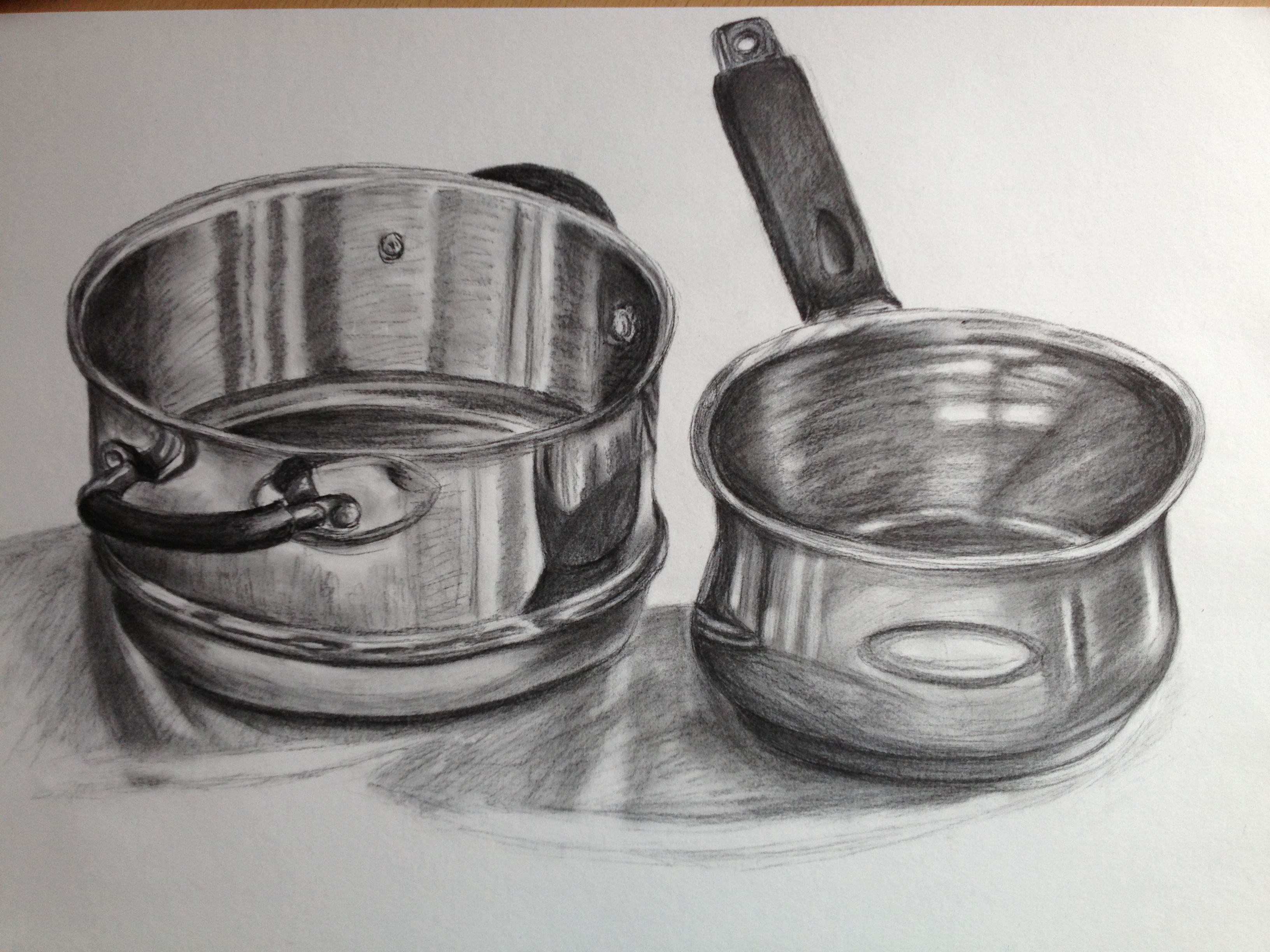
Exercise 2: Shadows and reflected light and shade
Although I had used charcoal for the previous, smaller study, I still found using it here a revelation; it was fantastic to be able to draw on such a large scale and so freely, working fairly quickly (something I haven’t done before with this material) . I found charcoal most agreeable when trying to portray the different shadows and light sources, as it is easily manipulated into a wide range of tones with the help of fingertips or a putty eraser.
Even though the objects are very similar (a stainless steel saucepan, and one part of a three-tier steamer of the same material), I am satisfied that I managed to depict a different surface effect on each on them, due to their placement in relation to the light source i.e. bright light streaming through my kitchen window onto the dining table. I used sweeping marks on the larger areas, and shorter, brisker marks on the more detailed ones i.e. handles of the steamer. I didn’t let myself get too bogged down with detail, therefore the result I have gained with such gestural, quickly-executed marks, lines and areas of tine is quite satisfactory. Again, as in the last exercise, I made sure to include the light reflected from the objects onto the table; this gives an indication of just how shiny they are!
I included the strange, oval-shaped reflection on each on the objects – this is my paper, balancing on the edge of the table while I drew! I thought it only right to add it in, for interest…
Conclusion
I am happy that I have been able to study reflected light in more detail, and practice with objects that could be viewed as rather difficult to draw, due to the high-shine surfaces and all of the light and shadows being thrown around. It is an area I will no doubt be paying more attention to in future, making sure to actively seek out these elusive areas when looking at objects closely.
Separating the cast shadows and reflected light from objects wasn’t a huge undertaking, but needed careful observation so that the two did not become confused. I found that half-closing my eyes helped me to identify between the areas; for example, in Exercise 2, the shadow of the steamer cast off to the left due to the original light source, and the slightly darker shadow and reflected light that it cast down onto the surface of the table. I half-closed my eyes throughout the drawing, and it helped immensely.
I have no doubt that I will be able to draw more reflected light throughout the remainder of the course, but currently I am pleased with the outcome of my work and can only strive to get better with further study.
Research Point: Patrick Caulfield
Positive and Negative space
Patrick Caulfield was – and still is – one of the most famous British artists of our time, and one whose place of rest in London’s Highgate Cemetery is completely in keeping with the bold, geometric forms he created whilst alive; his headstone is a stepped design, simply reading ‘DEAD’ in cut-away stone, creating negative shapes much like those in the paintings for which he was renowned. I shall be visiting an exhibition of his works at the Tate Britain on the 3rd August 2013, so I’m rather excited about seeing his work in person. My musings on this will be added in the Research and Reflection section at a later date…
I adore Caulfield’s work; something about the colourful ‘flatness’, or graphic qualities, of his work appeal to me as a person who loves large areas of bold colour juxtaposed with dark outlines at often perplexing angles. I admire how he has tackled everyday objects -often the same ones over and over – and tuned them into modern works of colourful art. I have yet to come across any of his works where the colours jar or the subject matter is mundane; this could be the case if the objects were painted realistically, which points to the fact that his treatment of them with colour and demarcating line is what makes them so desirable and a pleasure to set eyes upon as opposed to a chore.
One of my favourites has to be Still Life: Autumn Fashion (acrylic, 1978); the perspective is interesting, with the basket of leeks leading into the picture which makes you wonder what else lies beyond on the that table. There are so many contrasting patterns but as a whole the painting is a success and holds a wealth of interest for the eyes. The harmonising yellows and ochres compliment the cool blue tones of the tabletop. Only a select few objects are outlined in black to create various depths to the painting; it, to me, is a joy to look at.

Moving on now, to look at Caulfield’s use of negative and positive space. He clearly studied many forms and the pattern of light and shade that played off them, and figured out how to separate these areas into dark, mid and light blocks of tone. The clever use of such areas of suggests the light and shade, without the need to be realistic. The concept is simple, yet the effect so convincing that it is all our eyes need to to recognise the shape of an object and its setting, based on the shapes used.

Tasked with producing a drawing in Caulfield’s style, I set about making some small sketches of different objects in the context of positive and negative space. Rather than set up lots of compositions, I used Caulfield’s ‘White Wares’ works as inspiration, along with my imagination, and created possible ideas off the top of my head. Not all of them worked, needless to say, with just a couple jumping out at me. I chose to therefore develop these and do two drawings, side by side; one monochrome, one colour.

I divided my A3 sketchbook page in two, thinking that having the two drawings next to each other would provide an interesting juxtaposition. I started on the monochrome with artists pens, but quickly came to realise that adding colour to the whole picture would be a long and tiring affair and switched to pastels instead. I used pressure when applying the colour and was able to cover large areas quickly and fairly opaquely by blending. For the colour drawing, I chose complimentary colours to add interest, and used black over the green and red to deepen the shade so that the object appeared to be in a darker environment.

Of course, the results are nowhere near that of Caulfield’s work! I believe, in order to produce a more impressively emulating drawing, I would need more time to study light and shade patterns in rather dark environments…
