Category Archives: Project 6 – Drawing animals

Part Two: Project 6: Exercise 2 – Fish on a Plate with Check and Log

I visited a local branch of Morrisons that apparently had a good, wide selection of fresh fish, and was not disappointed.  I was at first tempted by the rainbow trout – perhaps for obvious reasons – but instead opted to spend a little more time studying the shapes, sizes and colours of all of the fish.  The supermarket lights were making the decision harder, due to the excessive yellow in them, but after much deliberation I chose a sea bream; a wide-bodied fish, steely-grey with subtle markings in yellow and pink.

In my A3 sketchbook, I undertook a quick full-body study of the sea bream in biro to get a feel for its shape, as well as studying the body close-up and taking numerous colour notes from various parts.  For example, there was a curious yellow-green marking on the head above the eye, and soft pinky-blue on the underbelly.  I found this took studious observation in order to identify all of the colours on the body.  When I was happy that I was ready to tackle the subject (my first drawing of a fish, in fact), I drew four rough compositions in both portrait and landscape format.  I wanted to make sure I had sufficient light hitting the fish in order to show off the many iridescent colours, as well as enough shadow to give it a three-dimensional feel and provide tone and contrast.  I found composition no. 4 more favourable than the others, as the head of the fish was bathed in light coming from the right and I had achieved an interesting foreshortening effect by coming down close to the floor and looking over the left (I chose the floor instead of the table for my background, for a change of scene…)

IMG_0400

I selected a piece of A3 190gsm watercolour paper (in fact, the only type I had) and began with a very light drawing in HB pencil.  Once I had done this, however, I felt the need to strengthen these lines with Winsor and Newton blue ink and a dip pen.  This gave me a satisfying, crisp outline within which I could build up the colours and keep them contained.  I was satisfied with the fact that there was almost equal negative space on either side of the plate, providing balance.  Admittedly, at this point I found it a little tricky to get the proportions of the fish correct due to the foreshortening but continuously checked negative space and proportions of other areas as I drew, for assistance.  The right-hand side of the plate is supposed to be closer to the viewer, therefore the leaf motif is more spread out.

IMG_0427

Once the outline was in, I began with lighter colours on the body, using watercolour pencils; pink and light blue on the belly, yellow around the face, lilac and grey on the mid-body.  I overlayed darker versions of these colours, varying pressure on the pencil where there were markings or shadows.  The rest was almost done intuitively, with no necessary order, until I was happy with colour and tone.  I used the eyes half closed technique to ascertain where the darkest areas should be (the eye and contour of the top of the body) and the lightest (the underbelly and tail).  Using a fine water pen brush, I proceeded to merge the colours I had laid down, to create the shimmering effect.  This is where I found the paper started to buckle, and I made a mental note to buy better quality in future.

I was aware that colour, rather than detail, was more important in suggesting the texture of the fish therefore I reduced the amount of marks I made, making only ‘suggestive’ ones to show scales on the mid-body.  Once again intuitively, I flicked some of the blue ink I had used previously onto the head portion, for interest and texture.  The plate and background were, I decided, to be kept fairly minimal so that the fish was the focal point; I added shadows to the plate using blue, purple and grey, with the background in dark grey and indigo to suggest the faux-stone effect of my floor.

Upon completing the drawing, I can see that my portrayal of shiny scales and the colours within them is rather successful, in that it suggests the texture and ‘wetness’ of the fish.  Most fish appear mainly silver, and viewed from a distance this appears to be so but the colours are still all present.  I paid close attention to the colours and feel I have stayed loyal to these and the structure of the sea bream in general.  Perhaps not too convincing is the plate; the right-hand side doesn’t sweep correctly at the bottom, and due to the extreme viewpoint and foreshortening, I feel I have made it appear oval, as opposed to round.

IMG_0430
Finished drawing – watercolour pencils and ink on A3 watercolour paper

Check and Log

  • What were the main challenges of drawing animals?  In this section, I have been challenged by drawing animals that I haven’t drawn before; horses, a cockerel and a fish have never featured in any of my previous work.  I didn’t struggle a huge deal though as I applied the principles that I have learnt throughout the rest of the course; keen observational drawing, identifying shapes and negative space.  What I did worry about was making the animals convincing enough, as there is a widely-accepted image in everyone’s mind of what a certain animal should look like.
  • Which media did you enjoy using most and which did you feel were best for the subject matter and why?  Using watercolour pencils properly for the first time drawing a fish on a plate was a learning curve; I had the pencils in my materials box but hadn’t used them for anything in particular – perhaps out of fear.  the effect was a little unpredictable, probably as I hadn’t had a lot of experience, but they served me well in depicting the texture and colours satisfyingly.  I cant imagine having used any other drawing media for the fish, and achieving the same iridescent effect.
  • Where can you go to draw more animals?  Think about the sorts of places that will give you opportunities for animal drawing.  Have you tried drawing a moving animal yet?  Places that come to mind are; the zoo, a pet shop, the park, other people’s houses (checking first, of course), animal shelters, theme parks/attractions, the seaside, in the woods…a lot more places than I had originally thought!  I admit to being petrified about drawing a moving animal but I guess there is always the technique of contour or gestural drawing, where the movements can be built up over eachother and still portray a convincing likeness of an animal.

Research Point: Anatomical drawings of George Stubbs

I began by looking, as instructed, at the skeletal structure of the cat, dog and horse.   The one I was interested in most was the cat; a creature I see most every day whizzing across the garden or strolling down the street.  I was amazed at how different the creature looked on the inside.  I drew some studies, taken from information on the internet, and felt that the process of drawing the internal structure helped me to get a ‘feel’ for the creature.  The skeleton appeared – to me – very dinosaur-like, what with the long neck, curved spine and long tail.  The spine struck me as being rather delicate, due to the large abdominal cavity that apparently relies on very strong stomach muscles to hold everything in!  When sitting, the bones in the hind legs sit almost flat against eachother, which suggests a huge range of movement in the knee joint and flexibility as a whole.

IMG_0379

Next, I undertook some studies of a horse’s head and torso in conte crayon on black paper; the head is a very robust structure, with a large and strong jaw/cheek bone and a broad forehead.  The torso hair takes on an extreme shine due to the muscle structure underneath causing dips and ripples in the body; I don’t feel I did this justice though with my study, which felt clumsy in conte crayon.  I also drew a handful of quick line studies, depicting various different horsey poses.

IMG_0380

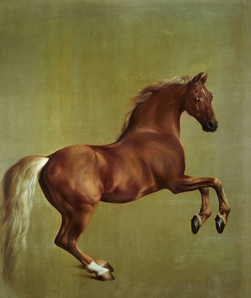
George Stubbs went to great pains to capture the anatomy of a horse perfectly and faithfully in his drawings.  He began his dissections of horses in 1758, which led to the engraved work ‘The Anatomy of the Horse’ in 1766.  There were 24 plates featuring horse skeletons and muscles, and also numbered outline diagrams that paired up with finished drawings based on his dissections.  The engraving below does not scrimp on detail, with each of the different elements making up the horse rendered lovingly as opposed to just a standard line drawing.  I imagine Stubbs wanted to study the texture of bone, muscle etc to aid him in his finished works, such as Whistlejacket, in order to ascertain their effect on the outer appearance and to ensure it was realistic and convincing.

Engraving from 'The Anatomy of the Horse'
Engraving from ‘The Anatomy of the Horse’
George Stubbs: Whistlejacket, oil, 1762

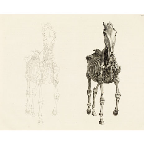
The front view of the horse, seen below, shows a rather delicate bone structure that may not be expected of such a creature.  This to me points to the strength of the horse and the fact that its body is extremely muscular, which would make up a considerable bulk of its anatomy.  Since this study appears to depict a horse stripped almost to the bone, this may explain the fragile appearance.

Engraving from 'Anatomy of a Horse' - front view
Engraving from ‘The Anatomy of a Horse’ – front view

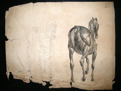
The rear view features more muscle, and one can clearly see the different muscles sitting alongside, on top or under one another.  The muscles are large, especially those in the hind quarters, suggesting great strength in the back legs.  The stomach muscles are also large and rigid, holding in vital organs.

Engraving from 'The Anatomy of a Horse' - rear view
Engraving from ‘The Anatomy of a Horse’ – rear view


References

http://www.nationalgallery.org.uk

http://www.racollection.org.uk


Part Two: Project 6: Exercise 1 – Grabbing the chance

Although I had managed to sketch my friends’ animals the day before, I was unable to gain access to them again as my friend has now departed on holiday.  So, as there are no other friends with animals available to me, and because I don’t own a pet myself, I decided to work from some photographs I took of a cockerel at our local farm, taken in the Easter holidays when I took a trip there with the children.  I have not drawn this animal before and was keen to find out how well I could recreate him on paper.

I had many photos of other animals, such as pigs and lambs, but the cockerel really caught my attention.  He was rather haughty but also seemed a little cautious, turning and either walking or running away from any humans that got too close.  Once he was back inside the safety of his enclosure, I managed to get some good shots of him through the mesh, preening his feathers and puffing them up proudly.

The cockerel is a curious creature, visually.  There is the obvious red comb and wattle surrounding the small, pinched features of the face, and I found it tricky to get a good focus on this part.  The ‘sickles’ (tail feathers) protrude upwards and fall downwards in an umbrella-style covering of the hind quarters, and the cockerel took great pleasure in stopping and styling these on many occasions.  The feathers around his neck were speckled with darker strips underneath, and I noticed that his whole body is in fact almost crescent-shaped, when viewed from the side.  I managed to capture him in various poses whilst at the farm – the strangest view being from above where the head is hardly recognisable underneath the large comb – and experimented drawing him in a variety of media, trying to keep the marks spontaneous and interesting.

IMG_0334

IMG_0332

For the larger drawing, I opted for oil pastels on A2 cartridge paper; I have become quite fond of using these and I thought I could achieve a good effect with the colours I saw in the feathers.  I had noticed blues, pinks and purples in the shadows on the white feathers, and the tail that appears just black in shadow actually has some rather beautiful blues, purples and greens that sparkle iridescently in the sunlight.

I began by drawing the rough outline of the cockerel in a light blue, followed by red to draw the comb and wattle and a flesh tone for the feet.  Using the same light blue, I added details of the white feathers that were cast in shadow, before overlaying pink and purple on the more darker areas.  I built this up gradually until I was satisfied the effect was successful, and then added the dark flecks on the feathers around the neck, using dark blue and purple (I avoid black where possible).

The comb and wattle were completed by layering red over pink, with crimson and purple for the shadow areas.  Here I used thick layers of oil pastel, as opposed to the directional lines I had used on the body; I don’t feel the technique would have worked well here.  The sickles were roughed in with dark blue, with thicker layers of purple, green and a little black to recreate the luxurious shine of the feathers.   To place him in context and anchor him to the floor, I then used yellow ochre for the floor covering in his enclosure, with touches of purple here and there for cast shadows.

I am pleased with the composition of this piece, and the pose I chose to recreate.  I love the arch of the cockerel’s neck, and the fact I managed to capture quite an intimate moment when he thought nobody was watching.  Having drawn the cockerel, I would love to study more birds in detail and will try and commit more time to do so in my sketchbook.

IMG_0370

Research Point: Renaissance masters’ animal drawings

Leonardo da Vinci

da Vinci was well-renowned for his love of animals, and the fact that he was vegetarian.  He apparently frequently liberated birds from their cages and questioned whether or not humans had the right to eat their fellow creatures.  So it is no wonder then that his drawings of animals are tenderly done with lots of feeling and a sense that he relished the time he committed to the studies.

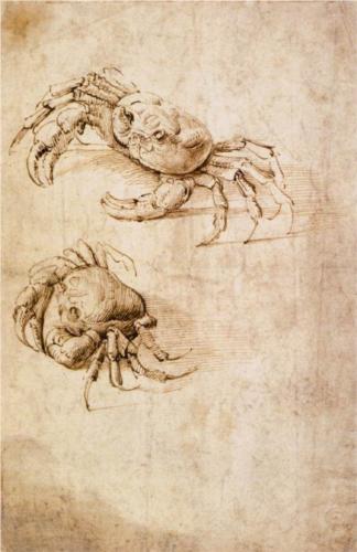
Leonardo da Vinci - Crab Studies
Leonardo da Vinci: Crab Studies, ink (date not found)

When searching for examples of his animal drawings, da Vinci’s Crab Studies immediately struck me as odd, as I am so used to seeing depictions of horses or cats.  I also find the image rather beautiful, and am in awe of how the movement of the crab has been captured from the upper to the lower drawing, if it is indeed studies of the same crab instead of a study of two crabs placed together.  The spindly legs and claws are captured with a selection of curved lines all joined together, and the tone work is exquisite in that it is the simplest of hatched marks to achieve shading and depth.

Leonardo da Vinci: Studies of Cats and Other Animals, c. 1513
Leonardo da Vinci: Studies of Cats and Other Animals, ink and chalk, c. 1513

Cats are quite common amongst my friends and family, and I was interested to find Studies of Cats and Other Animals and for some reason was surprised that cats in the 1500’s behaved and moved just like the cats of today!  To me, some of da Vinci’s cats appear to be ‘big cats’, as they have rounded ears and larger heads.  At the bottom right, I love the cat who has its back to us – comfortably sat, swishing its tail and paying close attention to something over on the left; this is the impression I get from looking at the way it has been drawn.  The outlines appear darker and thicker where the object is in shadow,  and once again tone is suggested with simple marks, with the texture of the cat’s fur cleverly depicted with directional lines.The variety of poses captured is impressive – I especially like the ‘angry’ cat near top left, whose fur is all standing on end, once again expertly shown with directional line work.

Leonardo da Vinci: Study of Horse and Rider, c. 1480

I am always amazed at how artists depict the muscular torso of a moving horse, not least da Vinci’s efforts.  In Study of Horse and Rider, it appears that the same horse and rider are drawn side-by-side, as though da Vinci were working on the two simultaneously.  Movement in the horse is shown through its head and leg positioning, and the lines here speak for themselves i.e. the folds in the skin of the neck, and the curved lines that suggest the bones and joints in the horses’ strong legs.  The attention given to the study of horse is evident in the fact that there are no ‘practice’ lines, like those seen around the rider.  It is as though da Vinci were more comfortable drawing the animal than the human in this instance.

Albrecht Durer

“Nature holds the beautiful, for the artist who has the insight to extract it” – Albrecht Durer

Clealry fascinated with nature, Durer depicted many animals in his lifetime, using a variety of media including etching, watercolour and ink.  For the purpose of this exercise, however, I have chosen only line drawings.

Albrecht Durer: A greyhound, c. 1500
Albrecht Durer: A greyhound, ink, c. 1500

This greyhound, just like da Vinci’s cats, would not look too out of place amongst the dogs of today; once again, I am astounded to find such an old drawing of a dog breed that I had considered to be ‘modern’ (I have little to no knowledge of dogs!).  The lines vary in delicacy and suggest the direction of the fur and how it sits on the certain parts of the dogs anatomy i.e. the protruding shoulder and hip bones.  I feel the success in this study is down to the accurate mid and dark tones achieved with the mark-making, which shows the muscular build of the dog.

Albrecht Durer: Two Seated Lions, 1521
Albrecht Durer: Two Seated Lions, silverpoint, 1521

Two Seated Lions features a well-observed profile of a lion, with its proud nose and protruding forehead.  The mane of both once again uses directional, single wavy lines built up in layers to depict thickness and fullness – one could imagine how it would feel to run a hand over it.  To me, the manes are the best part of this piece; I feel the face of the right-hand lion and the paws of both are not as well-observed as the rest of the study.  Maybe Durer’s aim here was to achieve a realistic drawing of how the mane sits.

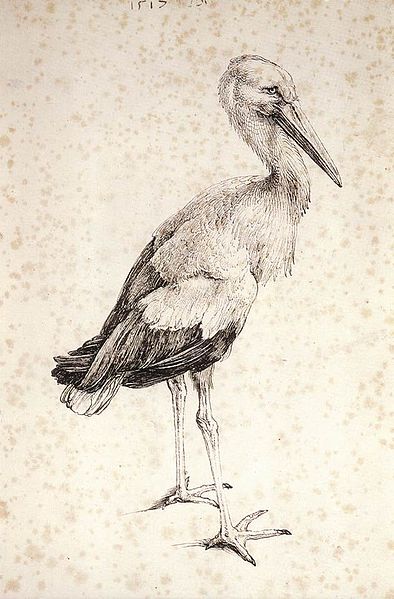
Albrecht Durer: The Stork, 1515
Albrecht Durer: The Stork, pen and ink, 1515

The ink drawing of The Stork features more shading than those previously, but this serves to add ‘weight’ to the birds’ torso, especially at the tail end.  The stance suggests how it is holding its weight, and the treatment of the legs – i.e. little shading – makes them appear lean and spindly.  From a distance it appears that detail has been fussed over when in fact only clever mark-making techniques have been used and layered carefully to depict a variety of feather shapes and sizes.  Marks are laid closely together to suggest the mid-tones, and the lightest areas feature marks with larger spaces in between, with directional marks on the head showing the shape of the birds’ skull.

References:

http://www.drawingsofleonardo.org

http://www.royalcollection.org.uk

http://www.wikipaintings.org